Youth event identity: D-Forma't
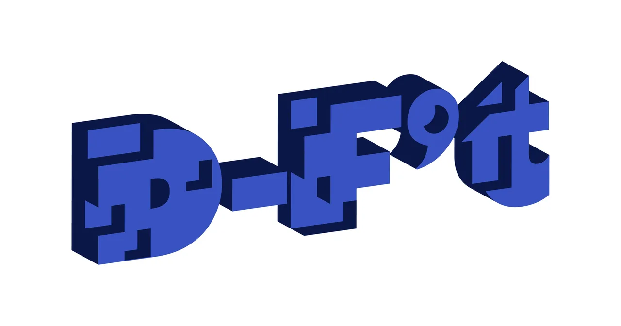
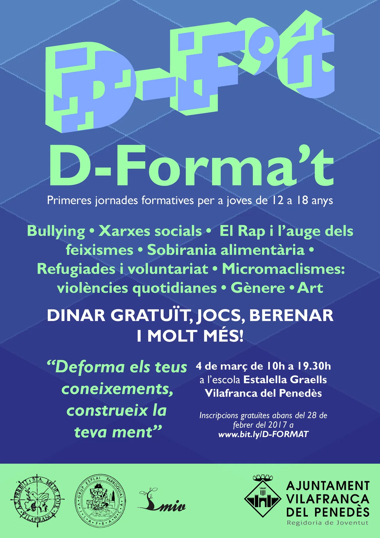
Identity for D-Forma't, the training day for 12 to 17 year-olds in Vilafranca: a 3D logo that deforms mental frames and structures so they can be rebuilt to measure.
- Client
- Entitats de lleure de Vilafranca del Penedès
- Year
- 2019
- Location
- Vilafranca del Penedès
- Services
- Visual identity, Event
D-Forma’t is a training day for young people aged 12 to 17 in Vilafranca del Penedès, a town in Catalonia’s wine country, organized by the town’s youth and leisure associations. This is a youth event identity case: how we gave a face to an event that brings teenagers workshops and talks that often fall outside school.
The challenge
The youth associations of Vilafranca wanted to bring young people workshops and talks on subjects that interest them, content that often falls outside formal education. The audience is demanding: between 12 and 17, flooded with images, with little patience for anything that looks made by adults. The image had to appeal to them, but it also had to explain what D-Forma’t is to the associations and to families, and it had to work over more than one edition.
The process
We started from the name. “D-Forma’t” already plays with the Catalan verb for training oneself and with the idea of deforming, and the concept grew from there: deform existing mental frames and structures so that they can be rebuilt to measure, based on what is learned in the talks and workshops the day brings together. Learning is not presented as something you receive, but as something you shape.
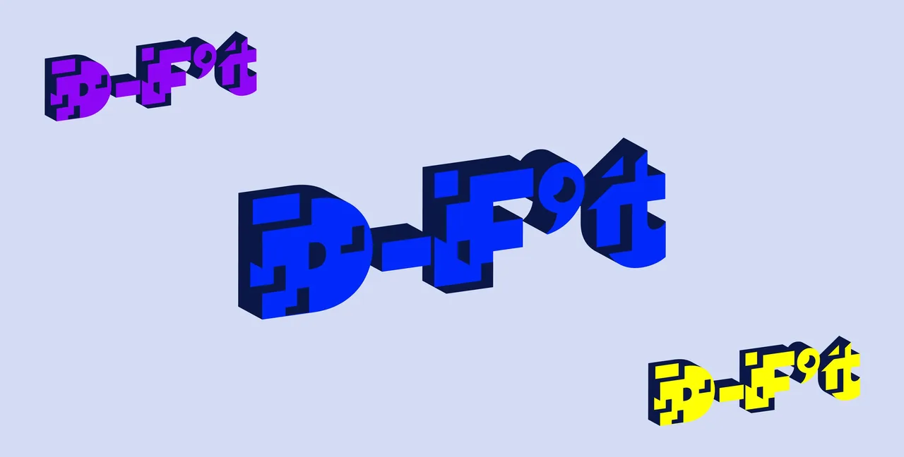
The concept became visible in a three-dimensional logo. The letters have volume and appear deformed, as if someone had stretched or pressed them. The logo was resolved in blue, and then in three color variants (blue, purple and yellow) on a lilac background, so the mark can change tone without ceasing to be recognizable.
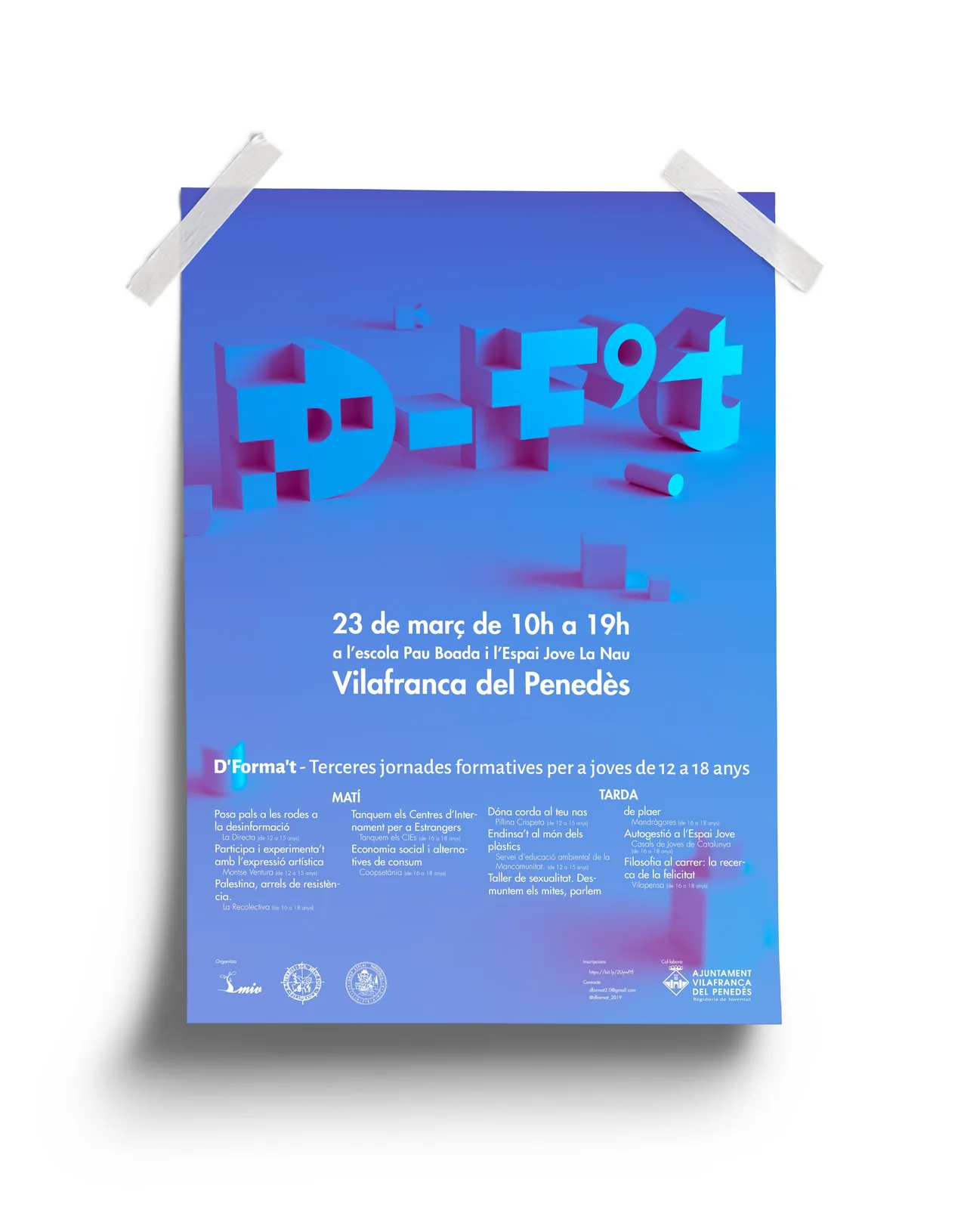
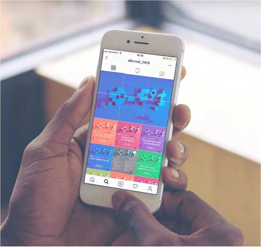
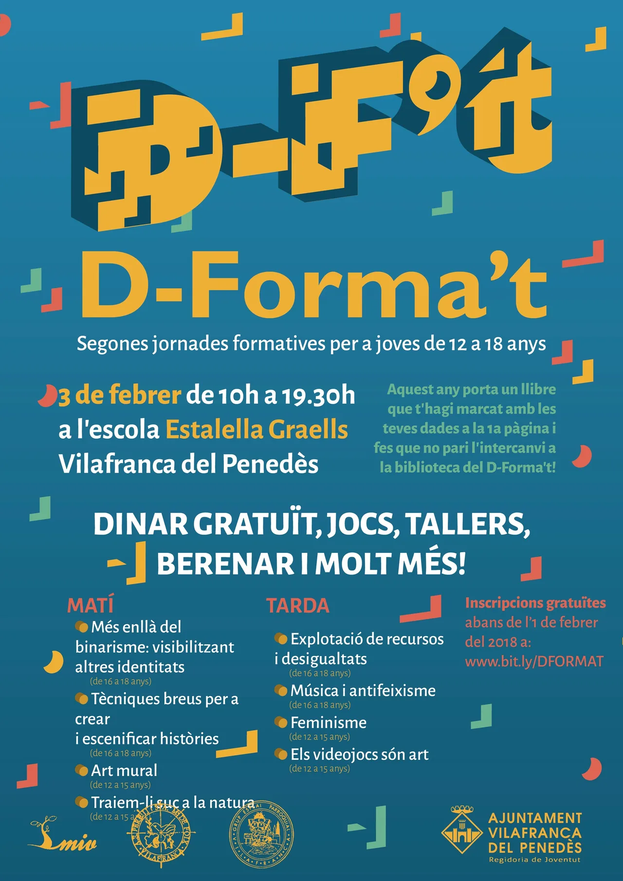
This logo is the center of the materials. It leads the poster for the first edition, in blue and purple, with the 3D logo and a green strip where the organizing associations appear. It changes colors in the poster for the second edition, in teal with the logo in yellow and geometric shapes around it. We also took it to a poster taped to a wall with a blue and pink gradient, and to the event’s Instagram profile, shown on a phone.
The result
The result is an identity that adapts to each edition without losing itself: the deformed 3D logo is the common thread, while colors, gradient and geometric shapes change from one call to the next. The two edition posters look like part of the same family, yet each has its own personality.
For the studio, it is a project that combines two things we like: working with local organizations and speaking to a young audience without talking down to it. If you are organizing an event for teenagers and need an image that speaks to them as equals, drop us a line.
Service: Brand identity and naming