Traditional fair rebranding: Fira del Gall 2024
Identity, posters, editorial and social media for Fira del Gall 2024. A heraldic rooster illustration and geometric forms that refresh the fair while keeping its heritage roots.
- Client
- Fira del Gall
- Commissioned by
- La Fatxenda
- Year
- 2024
- Location
- Vilafranca del Penedès
- Services
- Visual identity, Posters, Editorial, Social media
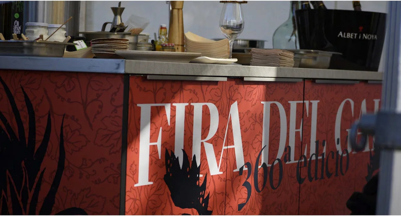
The identity we created for Fira del Gall 2024 is a traditional fair rebranding in the full sense: a new look for a long-running event in Vilafranca del Penedès, Catalonia, built so that the fair keeps the heritage character that makes it unique. This was the 360th edition, a number that says a lot about how deeply the event is rooted in the town.
The challenge
For the 2024 edition, the challenge was to revitalize the fair’s identity with a contemporary design that respected its cultural and heritage character. A fair this old calls for a delicate balance. If the design is too traditional, it fades into the memory as one more poster. If it breaks completely with the past, it can push away the people who come every year. And the fair is not a single activity: it brings together food, music and stage events, so the image had to cover all of it in one voice.
The process
We started from a dynamic graphic language that combines traditional elements with a vibrant, modern style. The centerpiece is a heraldic illustration of the rooster, surrounded by geometric shapes that evoke the variety of activities at the fair. The color palette starts from its protagonist, the Penedès Black Rooster, and works with red and black, the backdrop on which the logo reads.
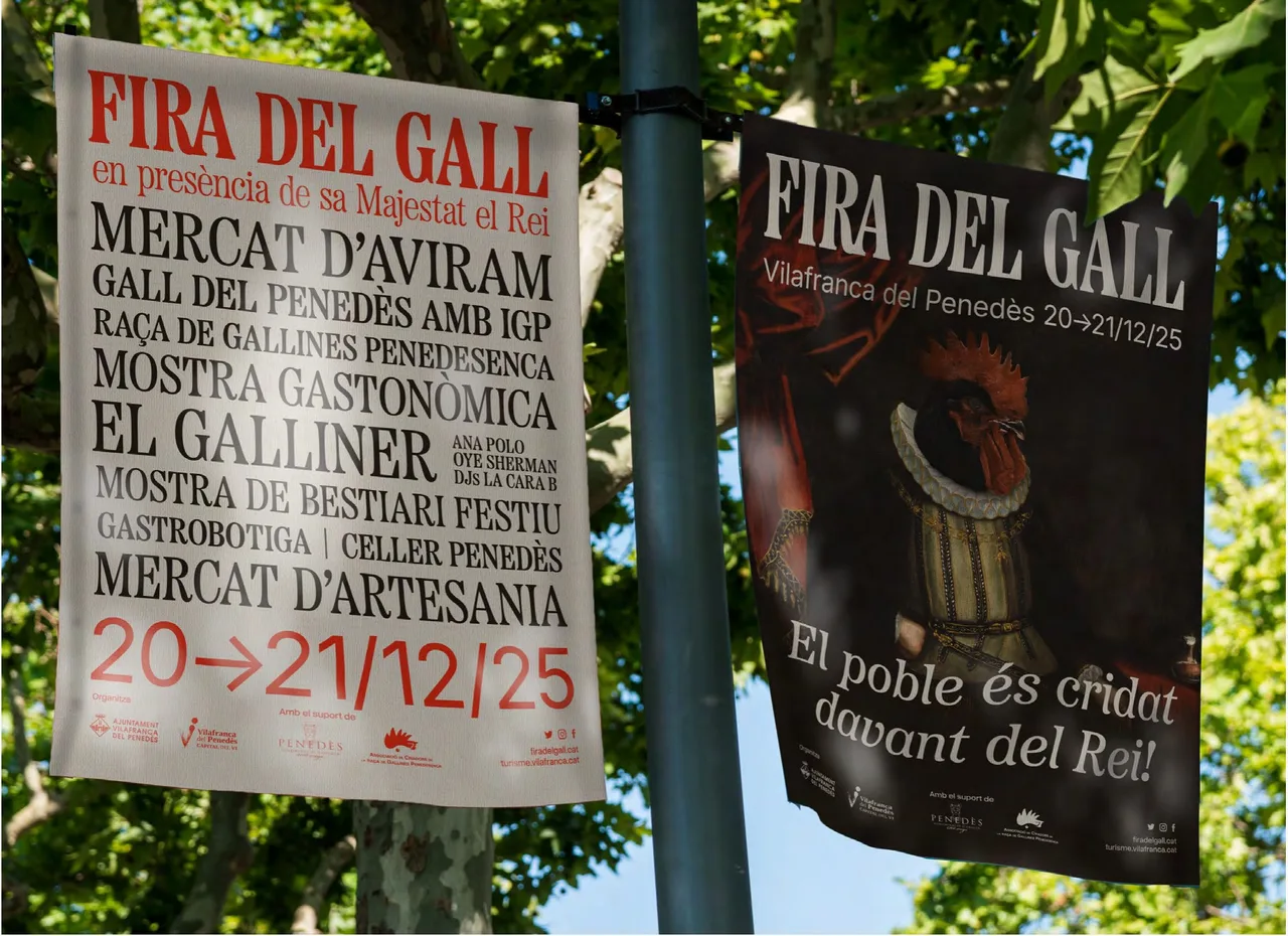
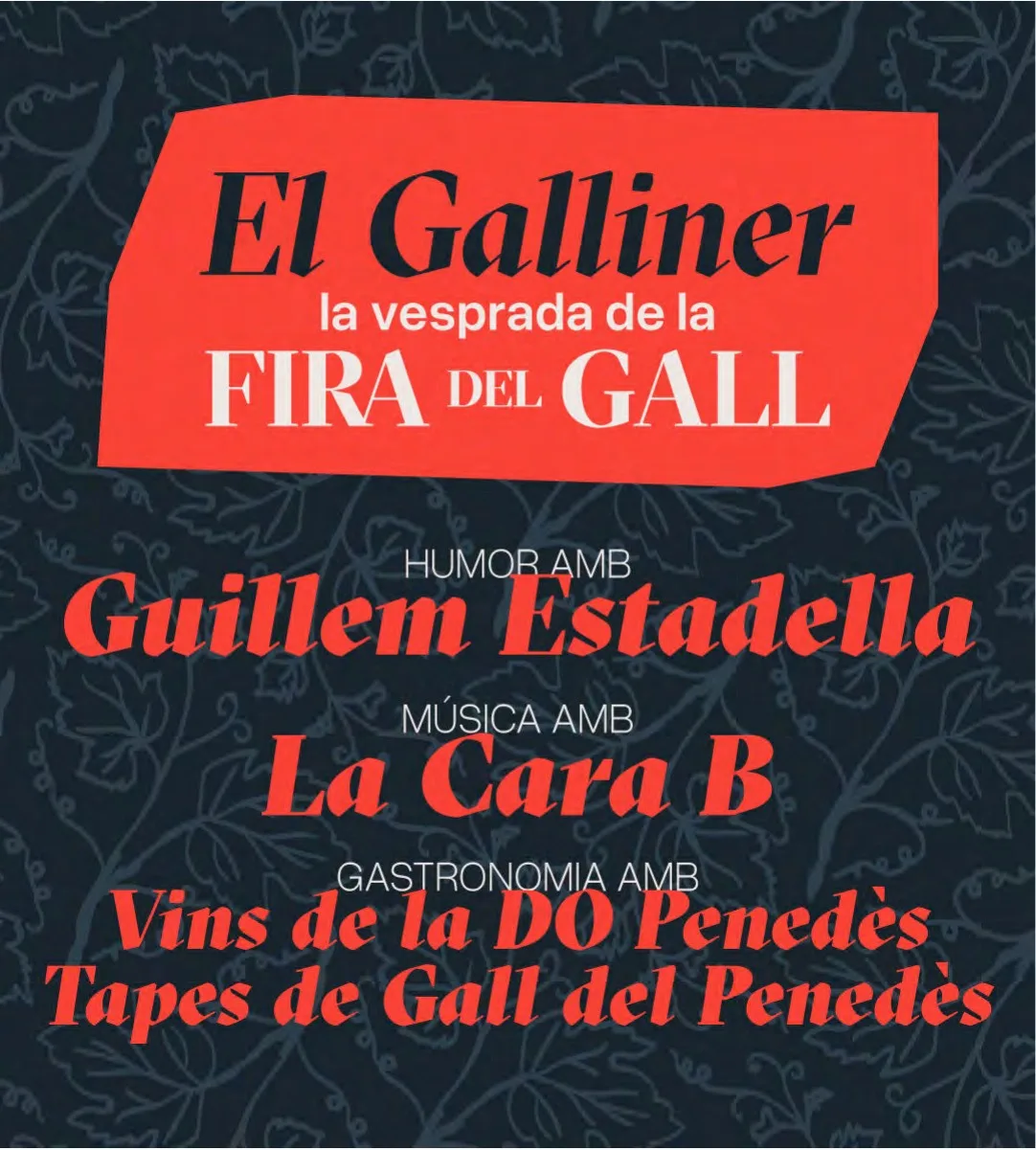
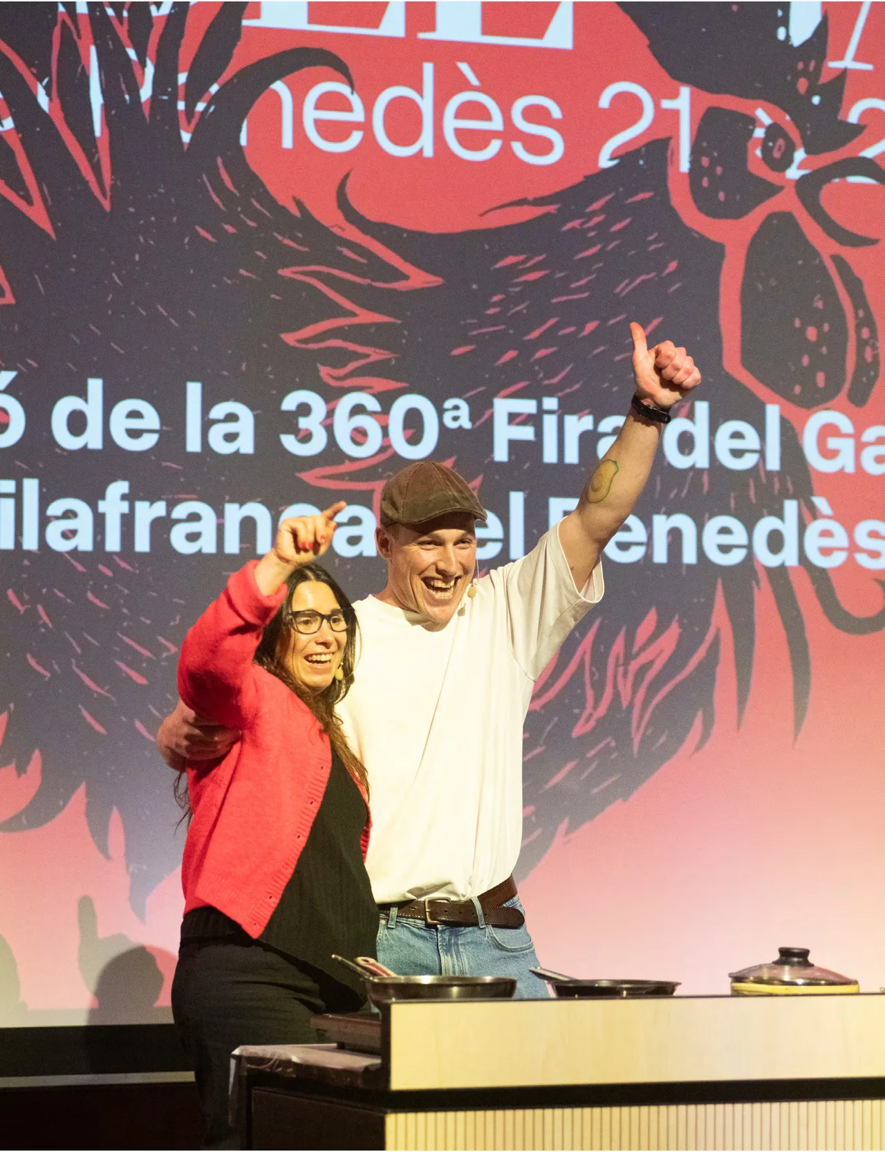
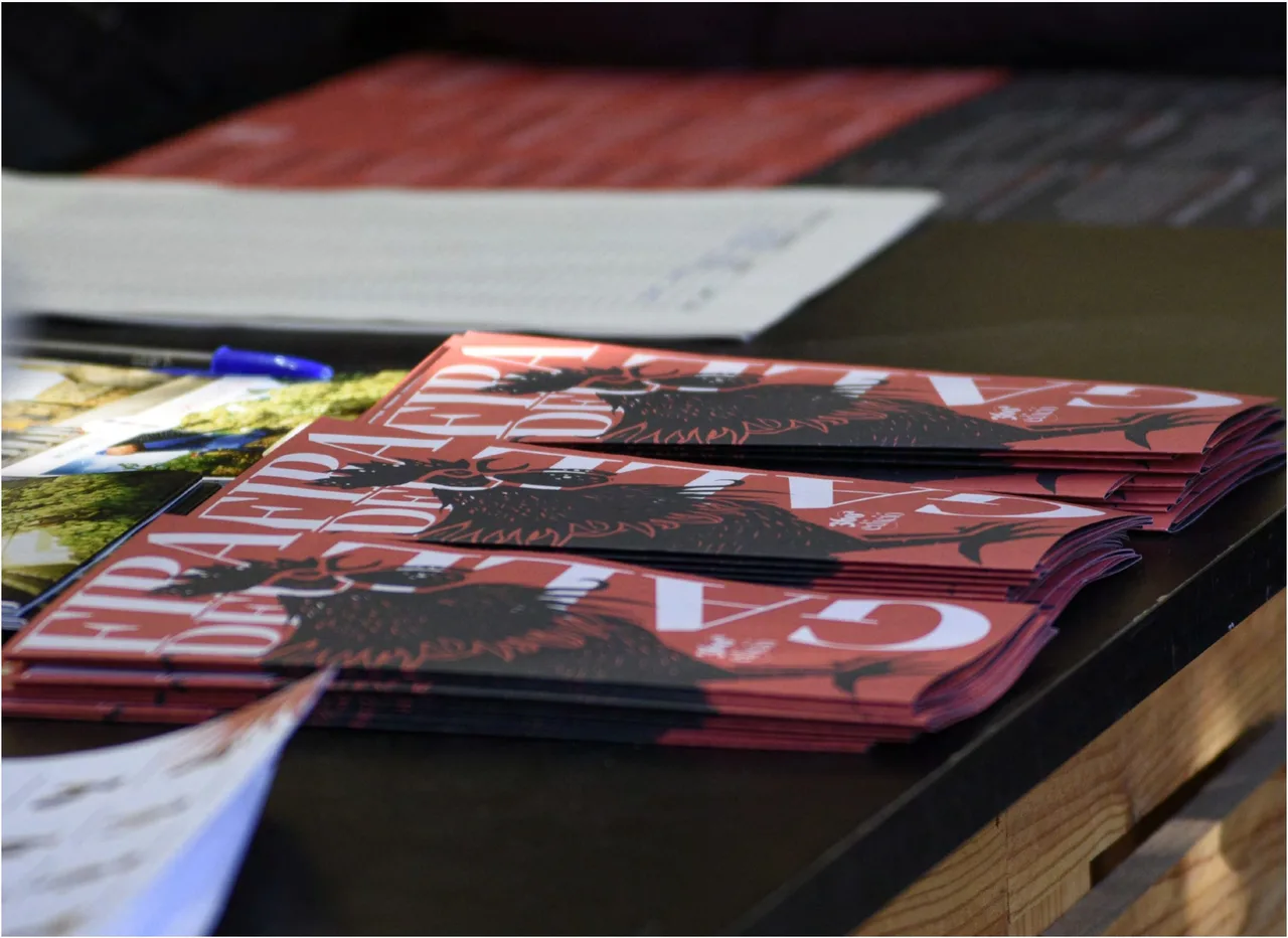
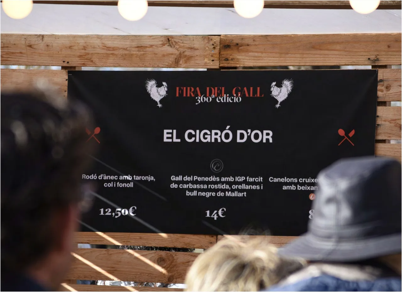
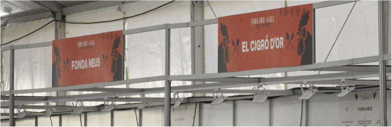
With that system we solved very different pieces. The logo of the 360th edition appears on a red background with the rooster illustration. The printed program, in red and black, picks up the heraldic emblem. For social media we designed pieces such as the one for “El Galliner, la vesprada de la Fira del Gall” (a Galliner afternoon of humor, music and food). The presentation stage got a red graphic backdrop, and we signed the stalls “Fonda Neus” and “El Cigró d’Or” inside the marquee, with a black menu board for the second one that repeats the fair logo and two roosters.
The result
The result celebrates the duality of Fira del Gall: an event that honors tradition while reinventing itself to connect with a diverse, present-day audience. The same illustration and the same palette move from paper to screen, from a stack of programs to the signage in the marquee, so the fair is recognizable on any medium.
The following edition took the fair toward a more theatrical language, but 2024 set a foundation: a heraldic rooster that speaks of tradition and geometric shapes that speak of movement. For the studio, it is how we approach the identity of a cultural event in the Penedès: start from what already belongs to everyone and give it a system, so it stays coherent on every medium.
Service: Brand identity and naming · Festival and event design