Fonament, architecture festival naming and branding
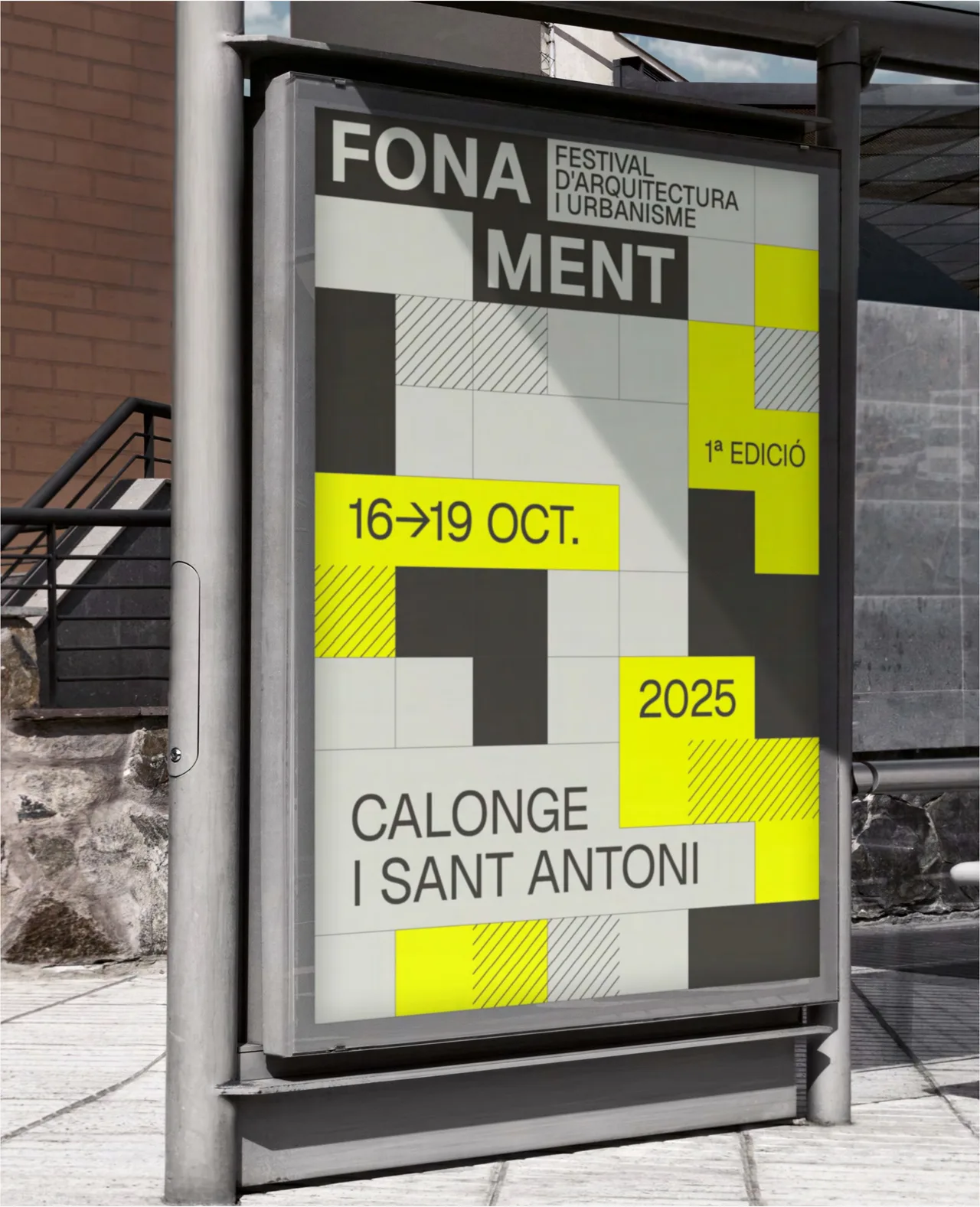
Naming, visual identity and applications for Fonament, Calonge's new biennial festival of architecture and urbanism. A modular grid system that fits blocks together like a floor plan.
- Client
- Festival Fonament
- Commissioned by
- La Fatxenda
- Year
- 2025
- Location
- Calonge
- Services
- Naming, Visual identity, Events
Fonament is a case of architecture festival naming and branding: the new biennial festival of architecture and urbanism in Calonge, for which we created the name, the brand and every application for the first edition.
The challenge
Calonge i Sant Antoni, on Spain’s Costa Brava, was getting a biennial architecture and urbanism festival meant to be a space for reflection, dialogue and cultural activity in the town. A new festival starts with no history: no name, no image, and nobody knows it. For the first edition we had to build the brand from scratch, and do it coherently enough that one system could serve street signage, social media, posters, motion graphics, merchandise and elements for stages and screens.
The deeper challenge was the audience: an architecture festival speaks to professionals, but also to neighbors, so the image had to be serious and approachable at the same time.
The process: a name and a grid
We started with the name. “Fonament” (Catalan for foundation) captures the physical and conceptual base of architecture, the origin on which everything is built. It is a strong, memorable word, with a play on “ment” (mind) that underlines the link between construction and reflection. The name already holds the idea of the festival and can be said in a single word.
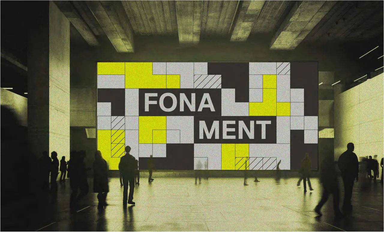
The identity starts from a modular graphic system based on a grid, reminiscent of floor plans and structures. The typographic logo plays with the arrangement of its letters (“FONA / MENT”) as blocks that lock together, and some variants explore three-dimensionality to suggest architectural volumes. The grid organizes all the information into cells, and the cells can be filled, left empty or hatched, as on a plan.
The palette is deliberately bold: light grays and black as the building material, and an acid yellow that flags the information that must be seen, such as the dates (October 16 to 19, 2025), the first-edition mark and the place, Calonge i Sant Antoni. The typography is a neutral sans serif, direct to read and without ornament, so that the grid takes center stage.
The result
We delivered a recognizable and highly adaptable system, from exterior signage to large screens, that establishes Fonament as a reference from its very first edition. The gallery shows how it works: the poster in a bus shelter, with the logo and dates, the banner under a stone arch, and the large screen in a hall showing the grid of gray and yellow blocks.
The same mechanism works on any medium: changing the arrangement of the blocks is enough to make a new piece different from the last one while it is still clearly Fonament. That is what we aim for when we build a brand from zero: a clear name, a simple system and rules that let it grow edition after edition without starting over.
Service: Brand identity and naming · Festival and event design