Community network naming and identity: Ordim
Naming and identity for Ordim, Vilafranca's urban commons network. The name comes from the Catalan verb for setting up the warp on a loom, and the logotype is built from horizontal lines that also form a modular system.
- Client
- Ordim, Comunalitat Urbana de Vilafranca
- Year
- 2026
- Location
- Vilafranca del Penedès
- Services
- Naming, Visual identity, Posters
- Link
- ordim.cat ↗
This is a case of community network naming and identity: that of Vilafranca’s Urban Commons, which started with no name and no image, and which is now known as Ordim. Here we explain how we arrived at a name that comes from the loom and a logotype made of lines.
The challenge
Ordim is a network of associations, collectives and local players in Vilafranca del Penedès, Catalonia, working for the social economy, mutual support and the shared management of resources. It started with a double challenge: to give a name and a face to a little-known concept, “commons” (comunalitat in Catalan), and to do it without sounding like local government. The name had to be understood and remembered, and the image had to serve very different organizations without overshadowing them.
The process
The studio created the name. “Ordim” comes from “ordir”, the gesture of the weavers of the past as they set up the warp threads on the loom: work that only succeeds if many threads are pulled together. A fitting image for a network that weaves alliances between organizations.
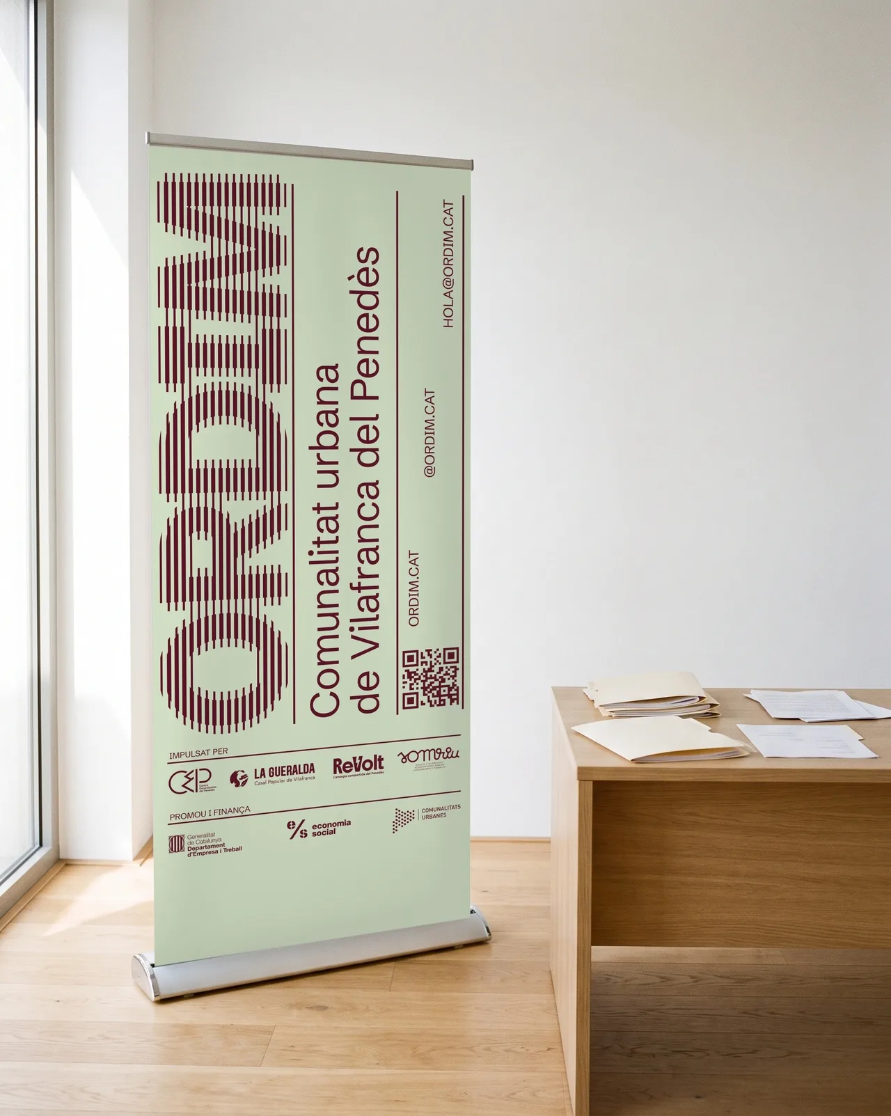
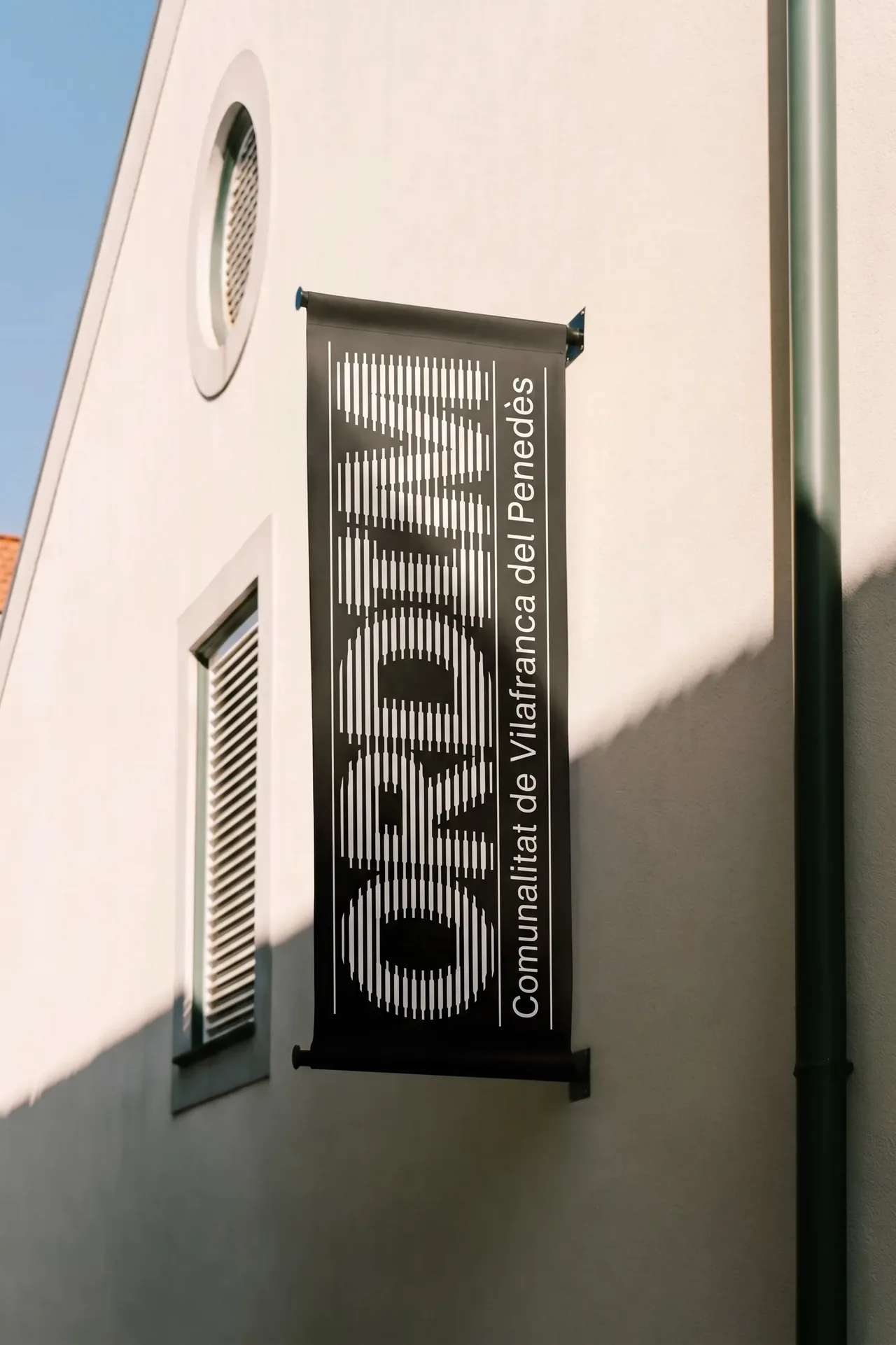
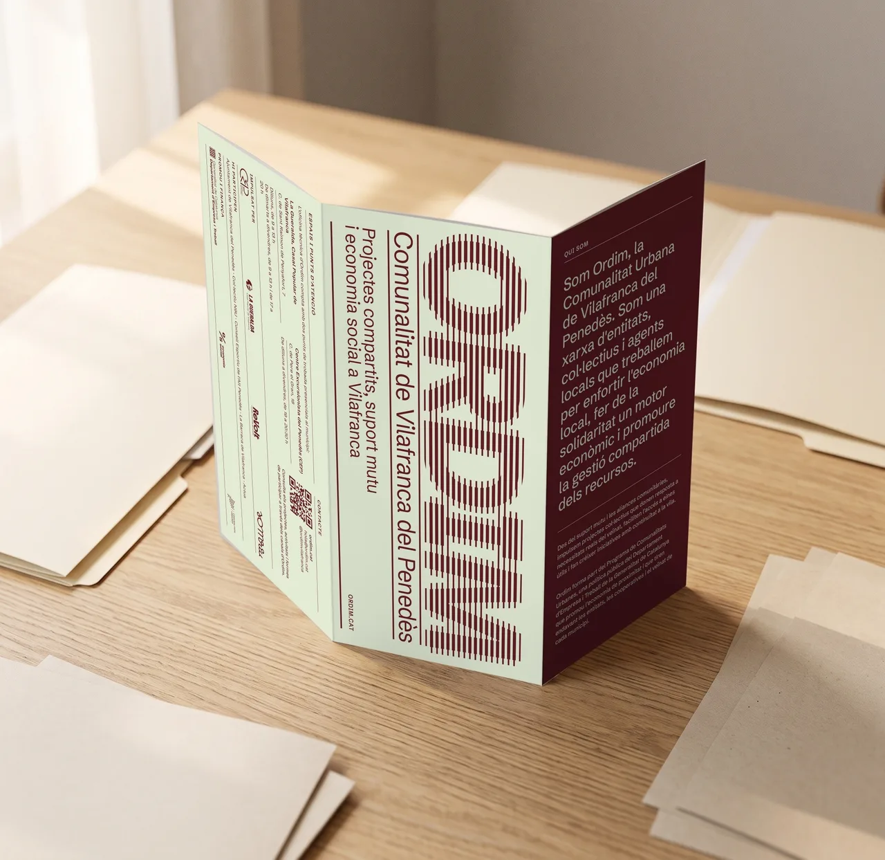
The identity grows from that thread. The logotype is typographic and built from horizontal lines, like the warp on a loom. The system also plays with the idea that the warp is the structure that comes before the fabric: you glimpse it but it is never fully there, because the spotlight belongs to the organizations Ordim supports. The same lines drive a grid system of modules used for charts, maps or image treatment when needed.
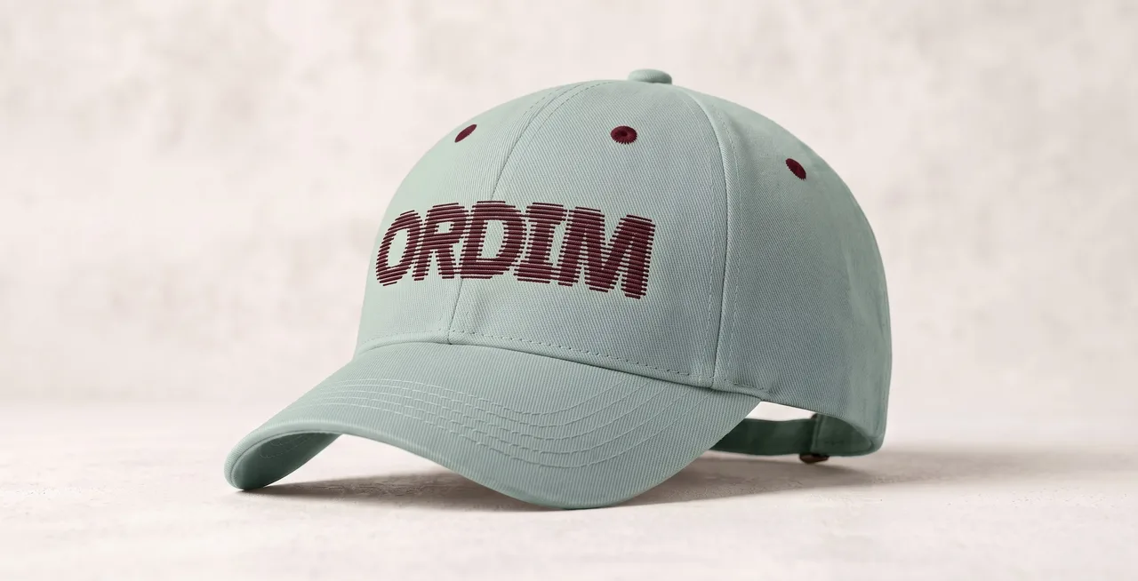
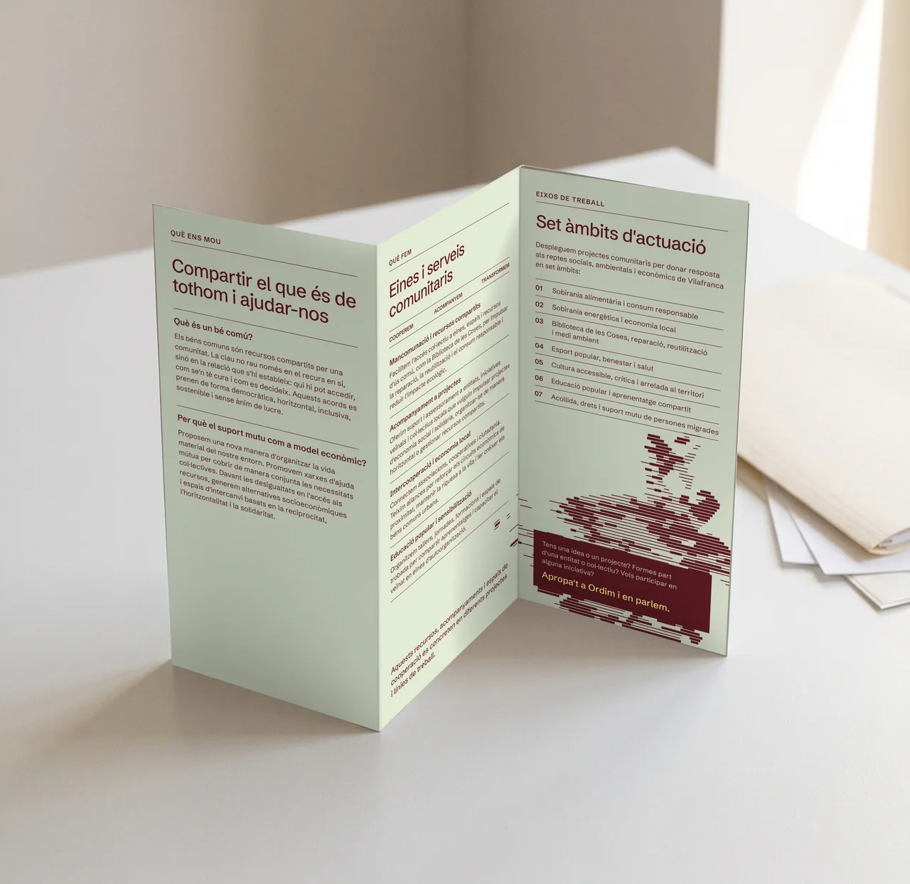
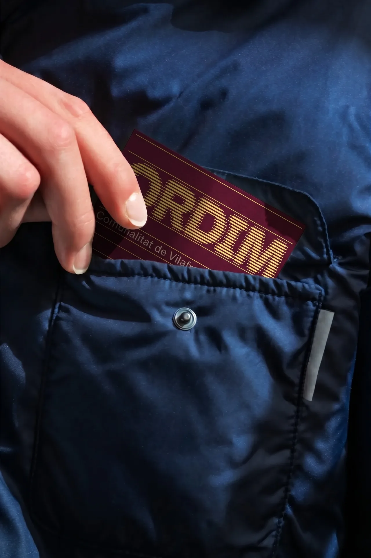
The palette combines burgundy, sage green and a creamy yellow, with a clean grotesque typeface that gives a voice both serious and approachable. With these elements we solved a set of pieces you can see in context. A roll-up banner with the logotype in burgundy on sage green. A flag hanging from a building facade, with the logotype in black. A leaflet with a sage green and burgundy cover, and an inside devoted to the areas of action and community tools. An A4 letterhead and business cards, and a sage green cap with the logotype embroidered in burgundy.
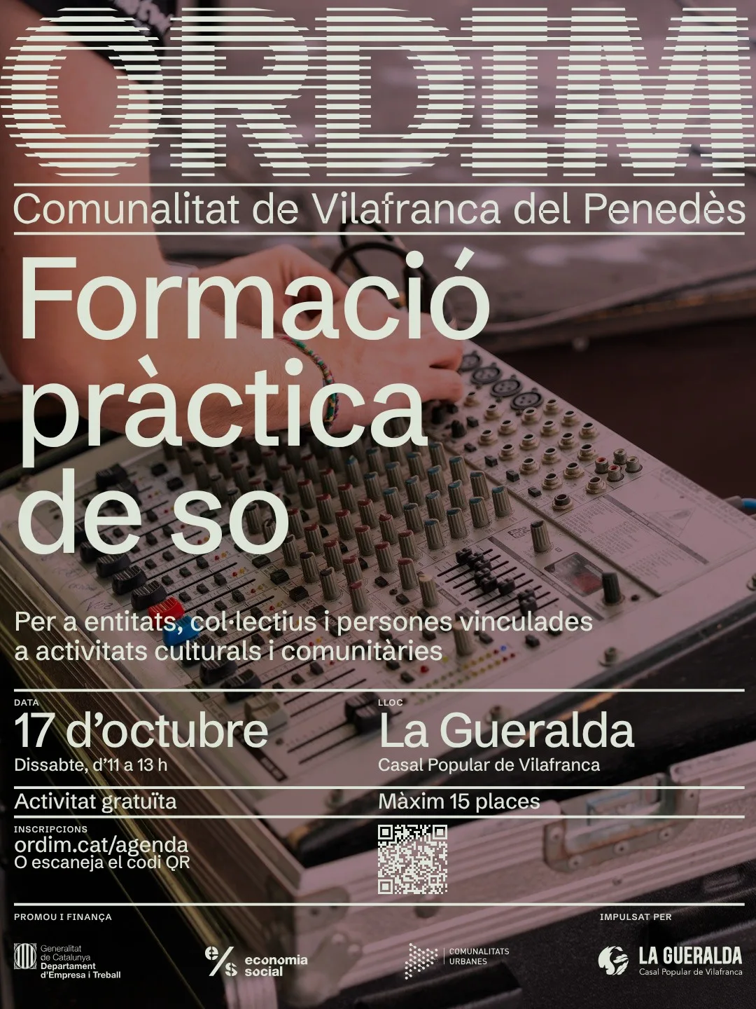
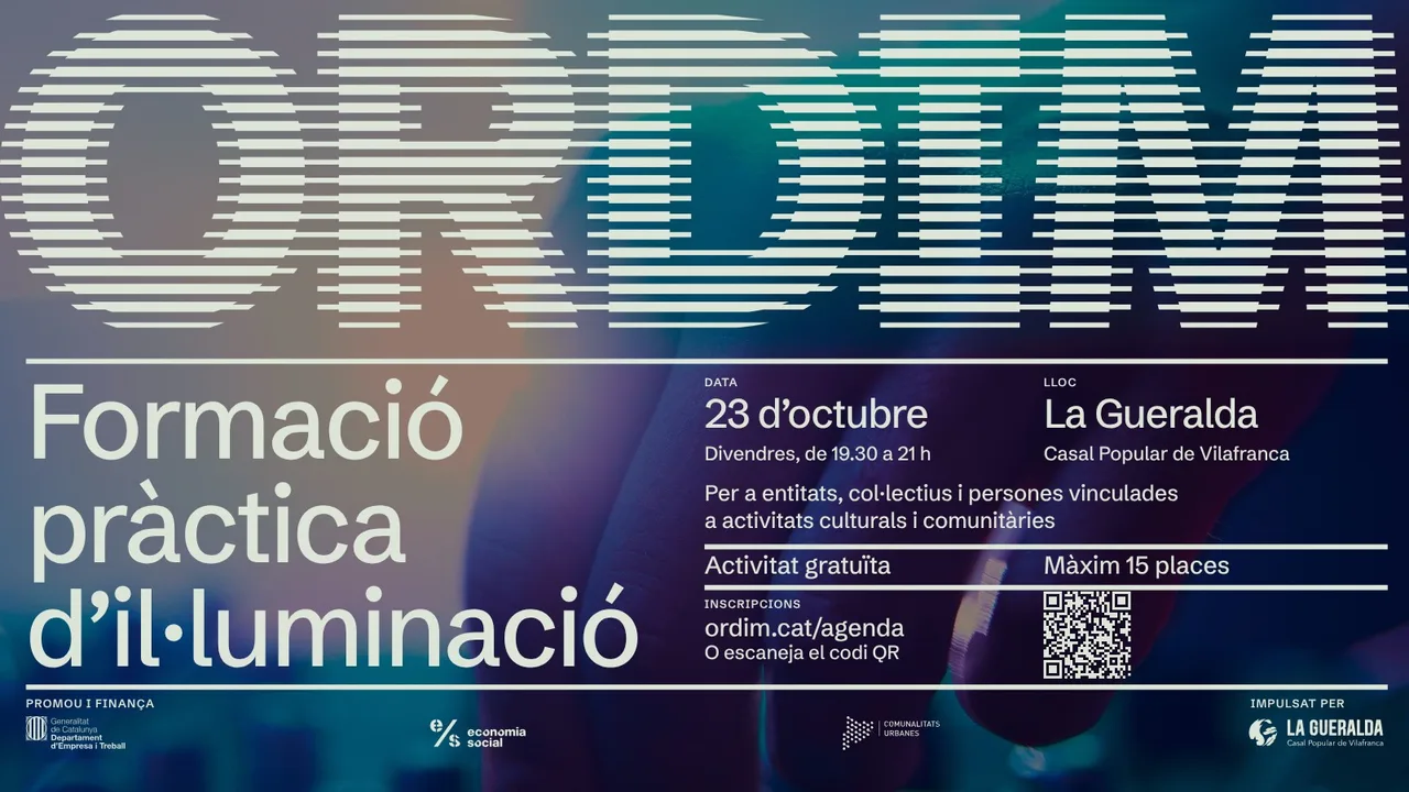
We also designed posters for the practical training workshops on sound and lighting, which carry the logotype across the top and show that the system holds up with different colors and compositions while keeping a family look.
The result
The result is a brand the network can use on a poster, a flag or a spreadsheet, and that does not compete with the organizations that make it up. The name explains the idea in a single word and the logotype draws it. The identity is completed by a website of its own, presented as a separate case, which applies the same language of lines and modules.
For the studio, it is a project that sums up what interests us most: putting brand judgment at the service of a collective project in the Penedès, with a name and an image that have to earn people’s trust from day one.
Service: Brand identity and naming · Festival and event design