Luxury real estate branding: Finques Vega Alarcón
Visual identity for Finques Vega Alarcón, an estate agency for independent luxury properties: experience and sobriety with a personal touch, through color and tone of voice.
- Client
- Finques Vega Alarcón
- Year
- 2021
- Location
- Esparreguera
- Services
- Visual identity
Finques Vega Alarcón is a real estate agency specializing in independent luxury properties (finques is the Catalan word for property or estate agency). This is a luxury real estate branding case: how we shaped the image of an agency that sells high-end homes but wants to sound approachable, with a logo, a pattern and a tone of voice that work together.
The challenge
The luxury real estate market tends to speak in a cold, magazine-style sobriety that impresses but keeps people at a distance. Finques Vega Alarcón had to convey experience and sobriety, because anyone buying or selling an important property wants trustworthy professionals, but also warmth, because a home is a personal decision. The image had to be convincing without sounding haughty.
The process
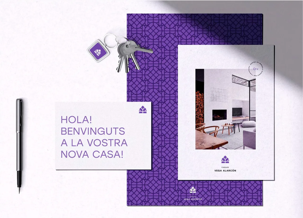
The solution is built with color and with the tone of the copy. Purple is the brand color. It is sober and unusual in real estate, and it can be used at large scale, as in the pattern, without becoming tiring.
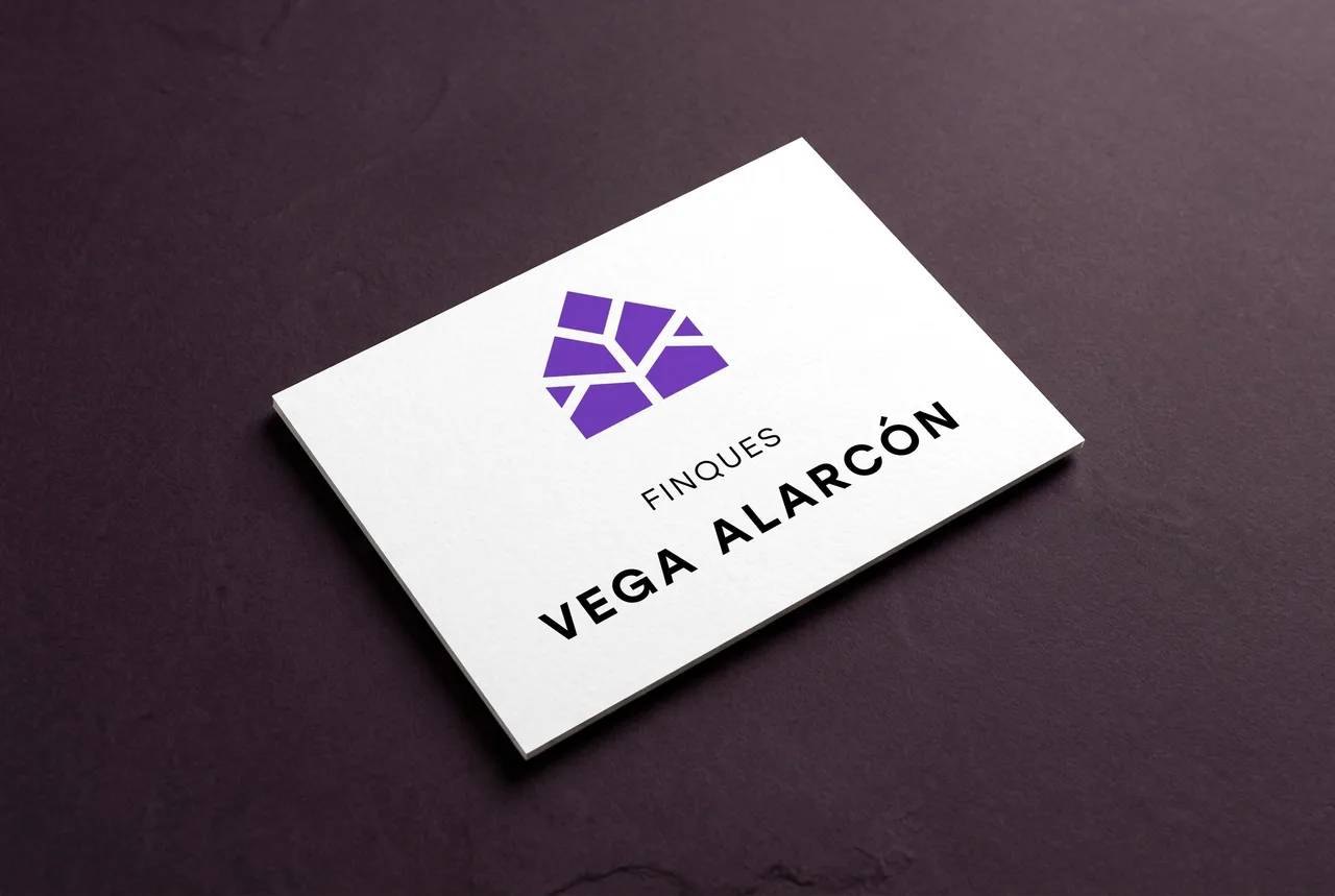
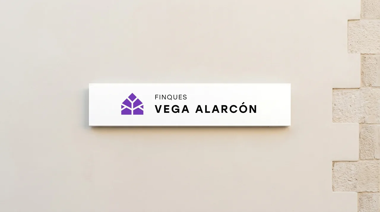
The logo has two versions, vertical and horizontal. In both, the symbol is a house drawn with purple diamond shapes, separated by white lines that recall the joints of a mosaic. Beside it, the name in capitals sits on two levels: “Finques” in a light weight and “Vega Alarcón” in a heavier one. The hierarchy reads fast and keeps the surname at the center.
The diamonds of the house repeat in a geometric pattern of dark lines on purple, which serves as a stationery background. This gives the identity a texture of its own without adding more elements.
The tone of the communication is the second half of the solution, and we showed it through a set of proposed applications (presented as a mockup). On a welcome card the text reads “Hola! Benvinguts a la vostra nova casa!” (Hello! Welcome to your new home!), in purple capitals, and that line sets a more direct and human voice than is usual in the sector. The card comes with a key fob carrying the symbol, so handing over a set of keys becomes a brand moment too. There is also a printed leaflet with a photograph of an interior, the logo and a circular seal with a key.
The result
The result is an identity that combines sobriety and warmth through a few well-decided elements: one color, a house made of diamonds, a pattern and a way of speaking. It is designed to work on stationery, on welcome material and on the key fob, and it is recognizable at first glance.
For the studio, it is a case that shows the identity of a prestige service does not rely on coldness but on precision. If you run an agency or a service business where trust and warmth must go hand in hand, we would be glad to talk.
Service: Brand identity and naming