Gallines de Pastura, organic egg packaging design from the Penedès
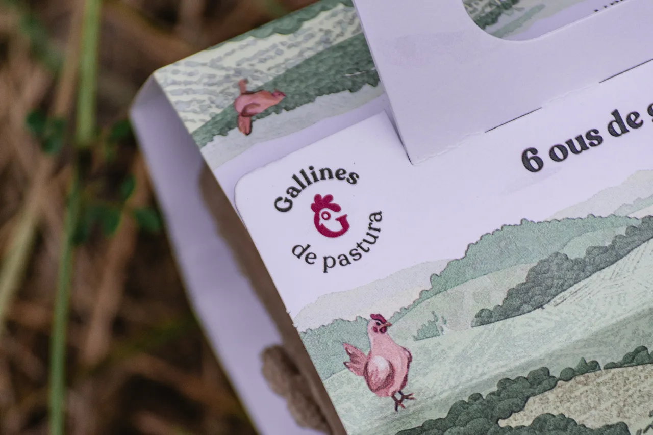
Identity and packaging for Gallines de Pastura, an organic egg producer in the Penedès: a hen-shaped logo and a minimalist landscape illustration full of grazing hens.
- Client
- Gallines de Pastura
- Year
- 2021
- Location
- Penedès
- Services
- Visual identity, Packaging
Gallines de Pastura is an organic egg producer in the Penedès, and its organic egg packaging design starts from a very simple idea: show the hens where they live, grazing freely across the landscape.
The challenge
Gallines de Pastura is dedicated to the welfare of its hens and to top-quality production. What makes it different is a portable henhouse that moves the hens to different spots across the territory so they can graze. That means the hens are not a detail of the production: they are its stars. The Penedès, for readers who do not know it, is the wine and cava region southwest of Barcelona, a landscape of vineyards, woods and low hills.
The challenge was to build a brand from scratch that explained this at a glance, on a product as everyday as eggs. On the shelf, organic eggs tend to share the same visual language: greens, leaves, handcrafted-looking typefaces. We needed a distinct and recognizable route.
The process: name, logo and landscape
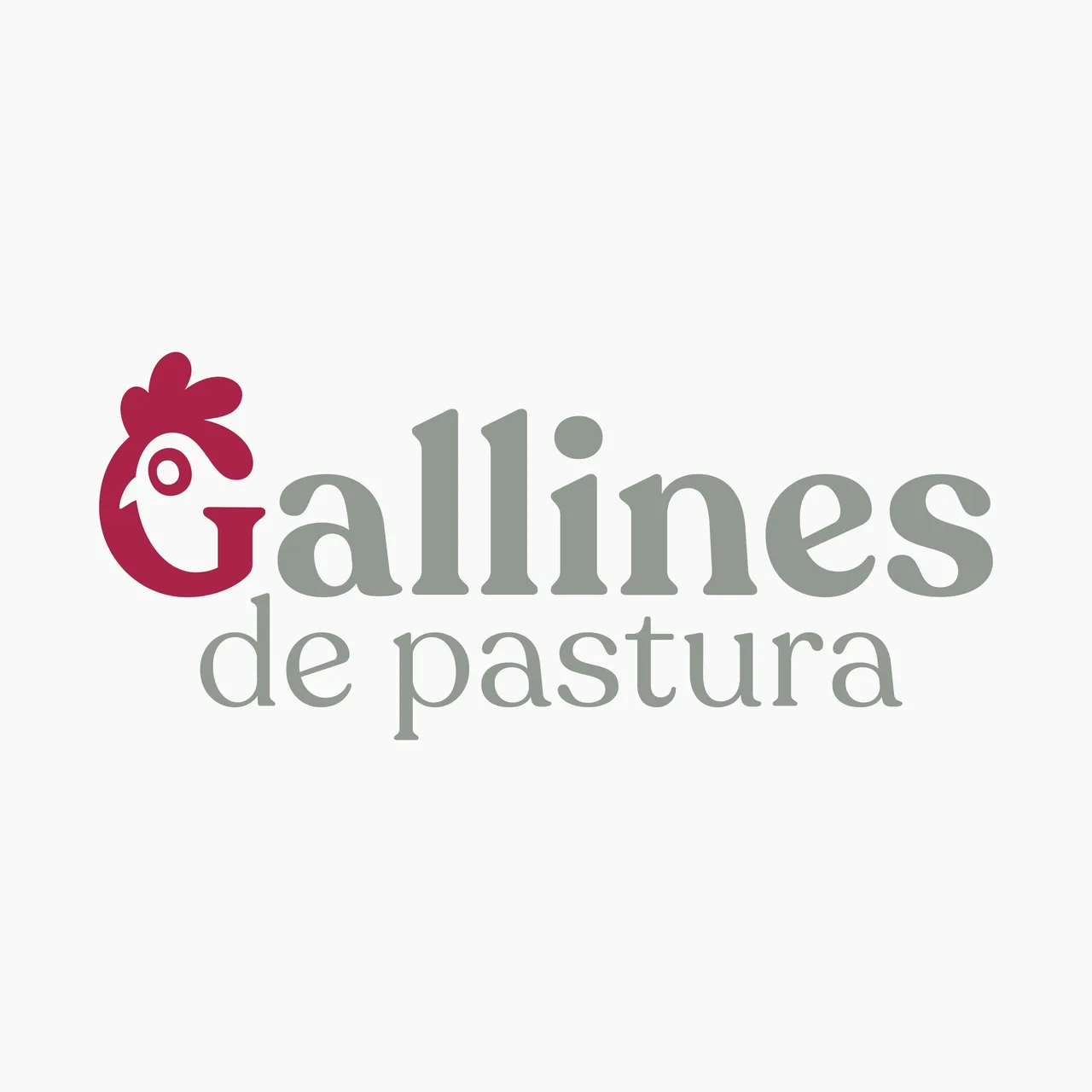
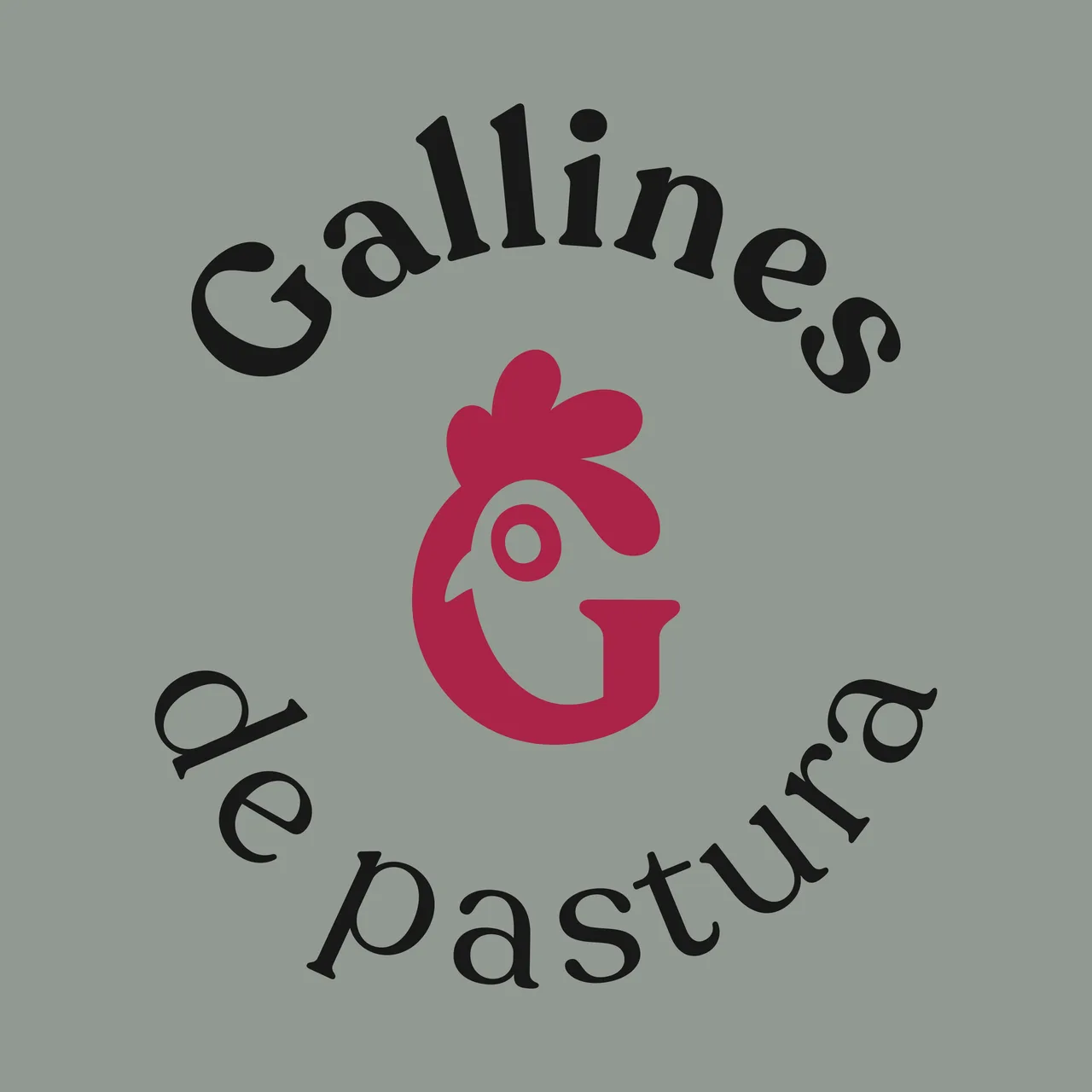
Since the hens are at the center of the project, both the name and the imagery revolve around them. The name, “Gallines de Pastura” (grazing hens), literally describes how they live. The logo is a pink hen that forms the letter G, and it also exists in a circular version, with the name set in an arc around the symbol. On the box, the typography is a sturdy, warm roman that gives character to the product information, such as the number of eggs.
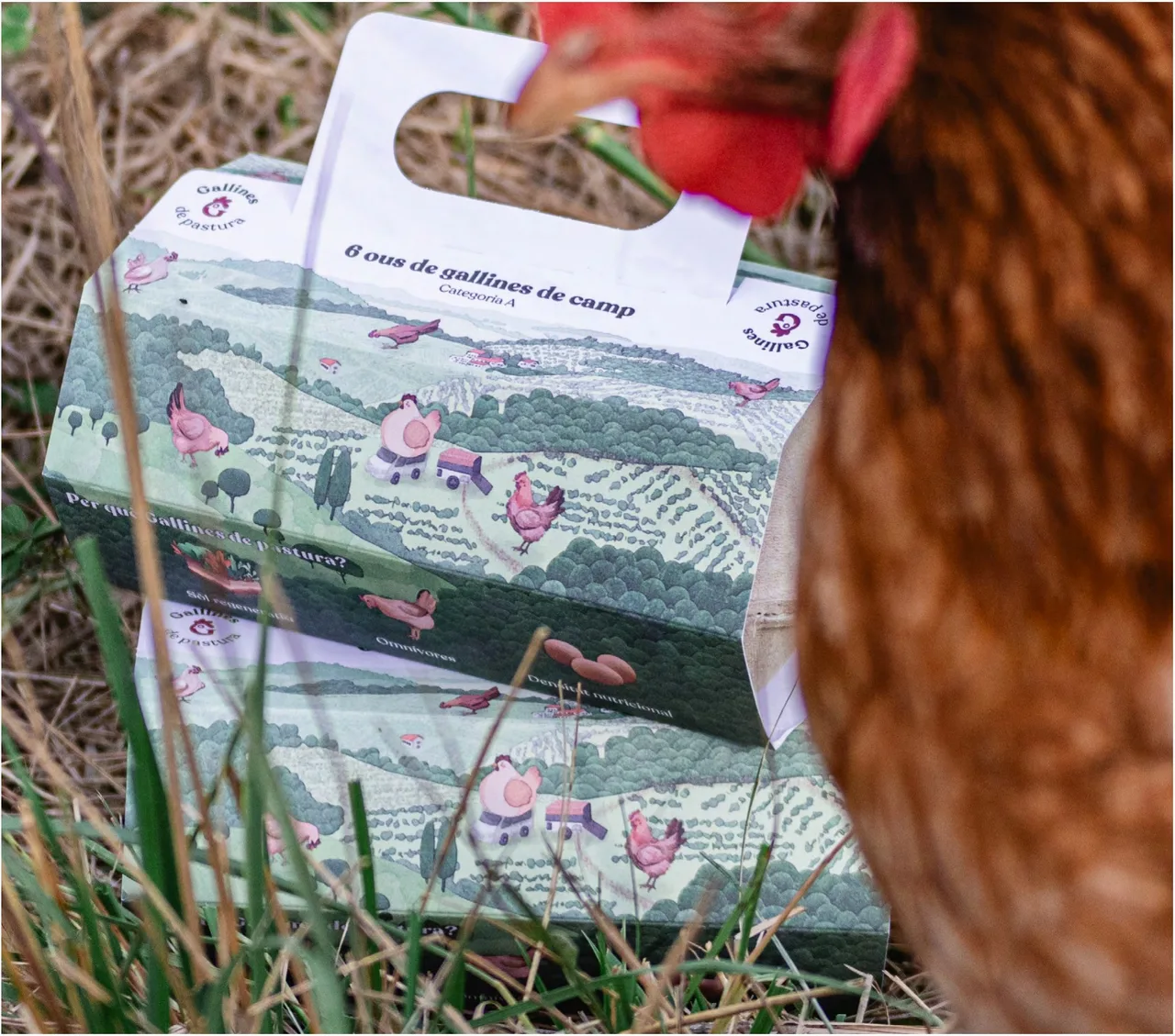
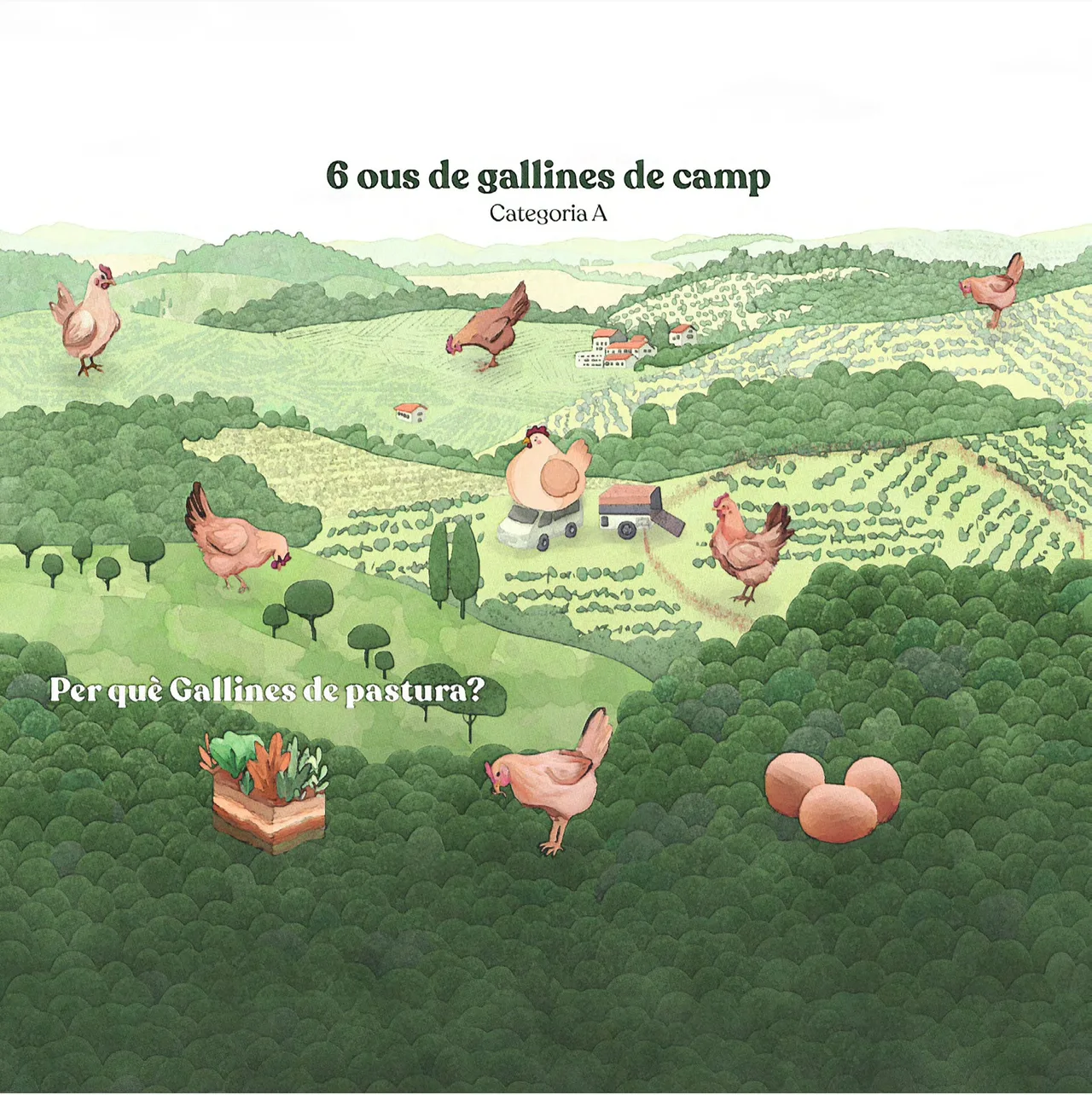
For the packaging we illustrated a Penedès landscape in a minimalist style: gentle hills, fields and woods drawn in fine lines and a palette of gray-greens. The hens appear in the scene in pink, scattered over the meadow like small adventurous characters grazing freely. The contrast between the pink of the logo and the greens of the background lets the brand stand out without any noise.
The landscape covers the whole surface of the box, so the package is also a small picture of the place the eggs come from. The box has a cut-out handle, and the circular logo sits on a white label with the product name, easy to read at a glance.
The result
The result is a visual identity and a package that explain the production model without long texts: anyone who looks at it understands these are eggs from hens that live outdoors, in the Penedès. The pink of the hens, unusual in this sector, helps the brand get recognized on the shelf, and the illustration gives the product a personality that unbranded eggs lack.
For us it is a clear example of how a local product can have packaging with a point of view: find what is truly different about the way it is produced and turn it into a visual asset. In this case, what sets Gallines de Pastura apart is that the hens go out to the meadow, and that is why they are the ones on the box.
Service: Brand identity and naming · Packaging and wine labels