Penedès winery branding and wine labels: ERAVi
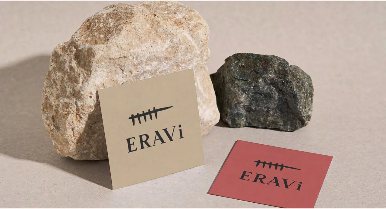
Logo and website for ERAVi, a winery revived by a young winemaker: a timeline that tells the winery's story and vines that stand for the care put into every bottle.
- Client
- Celler ERAVi
- Year
- 2021
- Location
- Penedès
- Services
- Visual identity, Web, Packaging
- Collaborators
- Maria Subirana (INHERENT)
ERAVi is a winery in the Penedès, Catalonia, revived by a young and passionate winemaker. This is a case of Penedès winery branding and wine labels: the logo, the bottle labels, the corks and, later on, the website. A brand that tells where the wine comes from and how it is made.
The challenge
The Penedès is Catalonia’s wine region, close to Barcelona and known for cava and for the still wines of the area. ERAVi is a winery starting up again in the hands of a young winemaker who makes wine in a way that respects both the environment and the generations that came before. The winery needed an image that explained that commitment without falling into the cliché of the traditional wine estate: one that honored its heritage and, at the same time, spoke of a winery beginning a new chapter.
The process
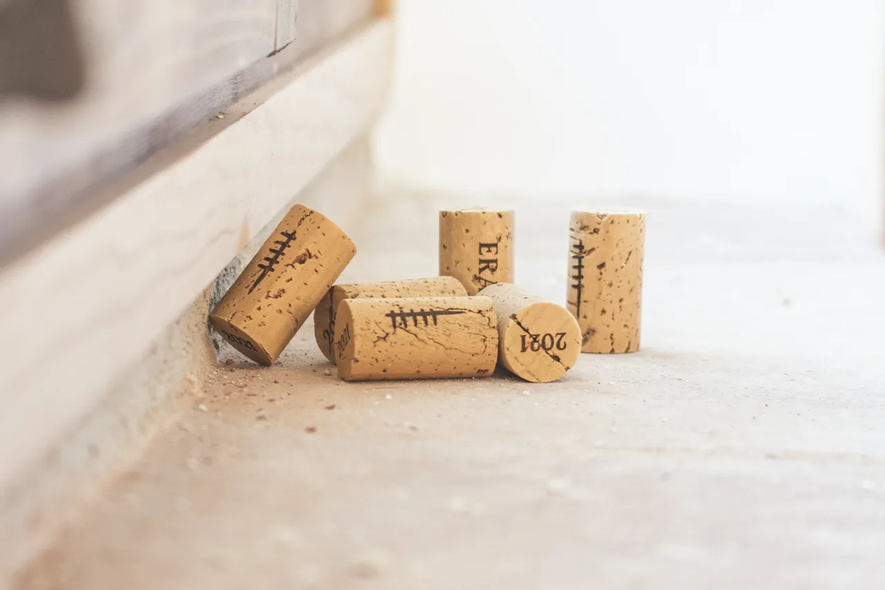
We began with the logo, which reflects that commitment: a timeline that represents the winery’s history and vines that symbolize the care put into every bottle. The pieces show the five-stroke timeline, which comes back on the corks, marked with the line and the vintage year.
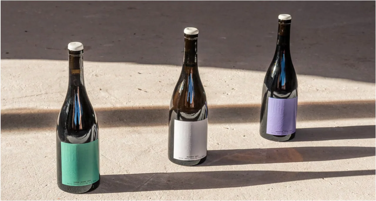
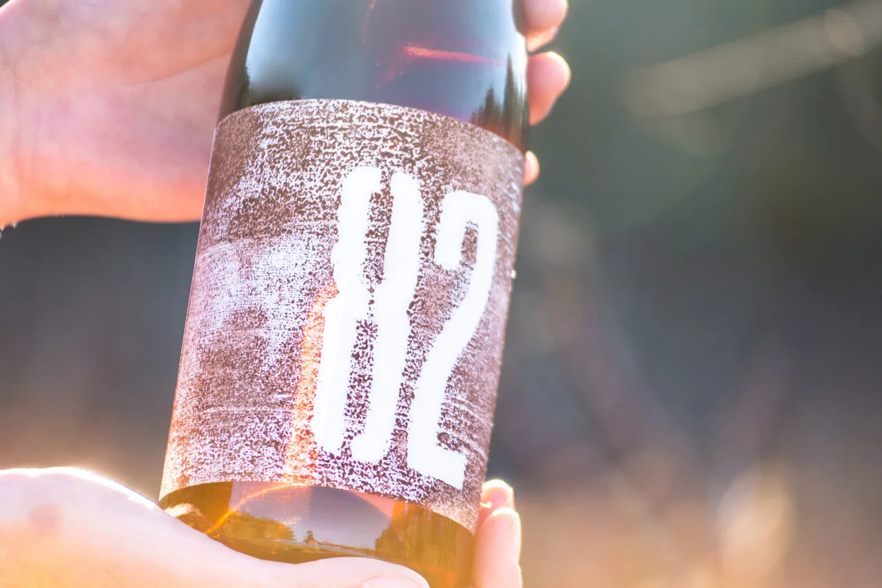
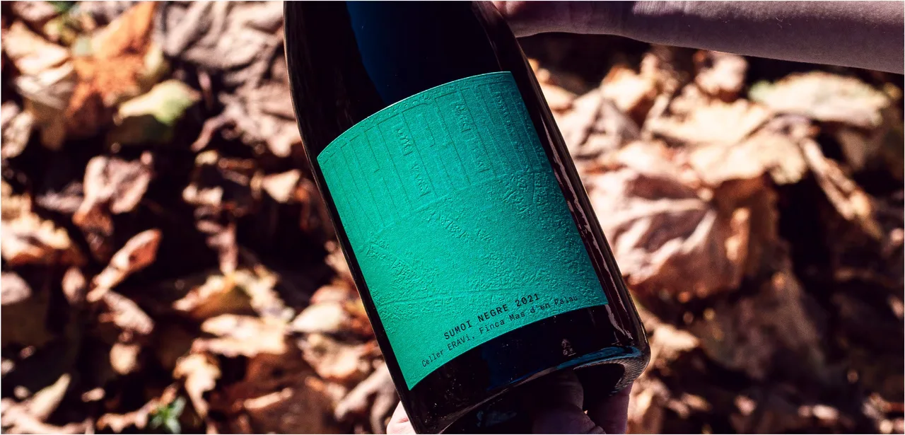
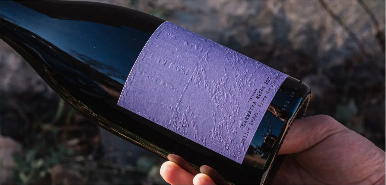
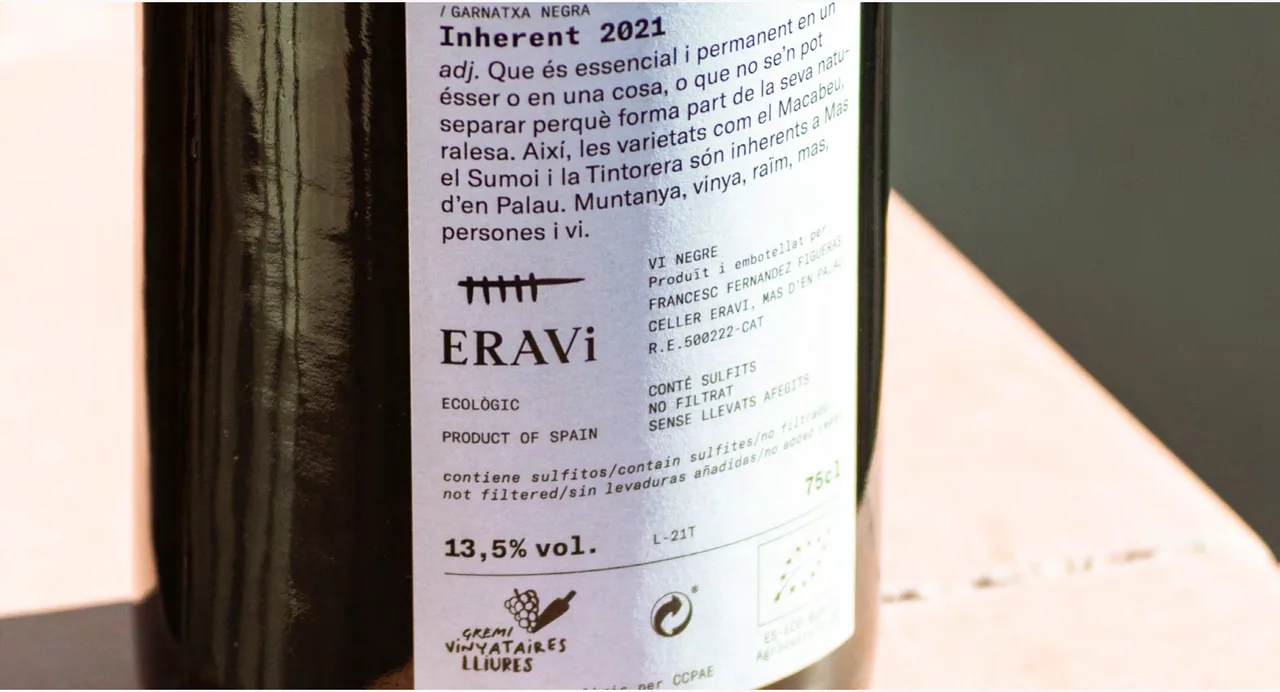
The labels use textured paper, and each wine has its own color: a green label, a white one and a lilac one, also textured. One of the labels carries the number 82 in white over a grainy print with an almost handmade feel. The back label holds the logo and the text of the wine, such as the Inherent 2021 Garnatxa Negra. All the pieces live together as a family: the color and the paper change, but the logo and the way it is composed stay the same.
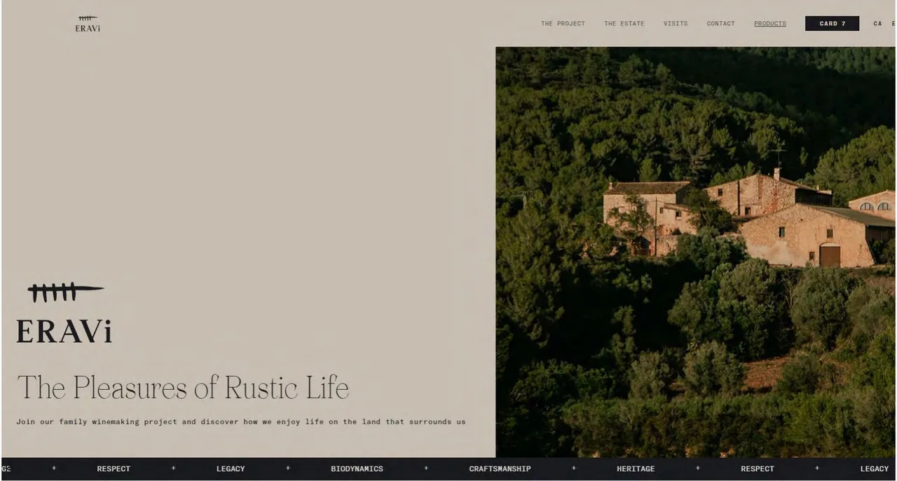
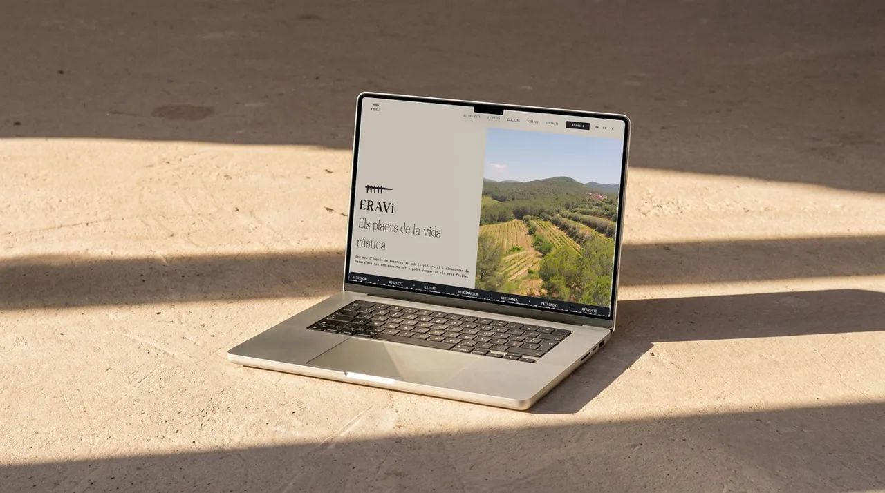
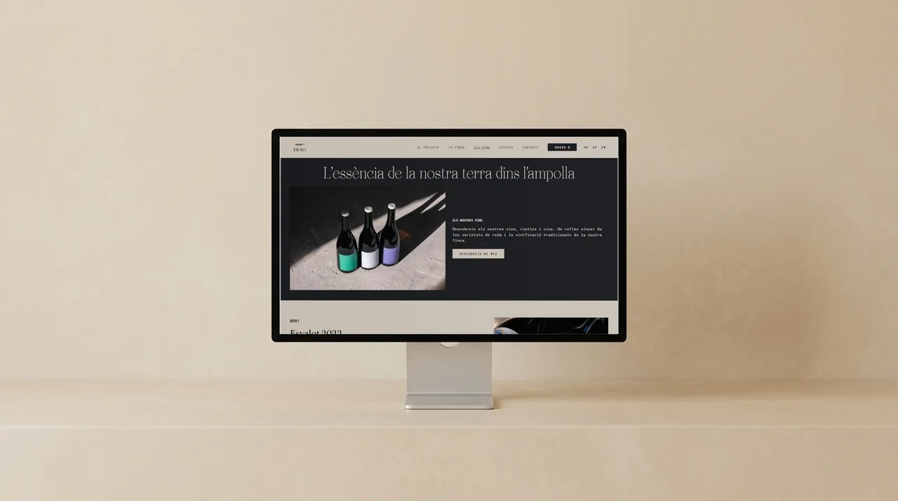
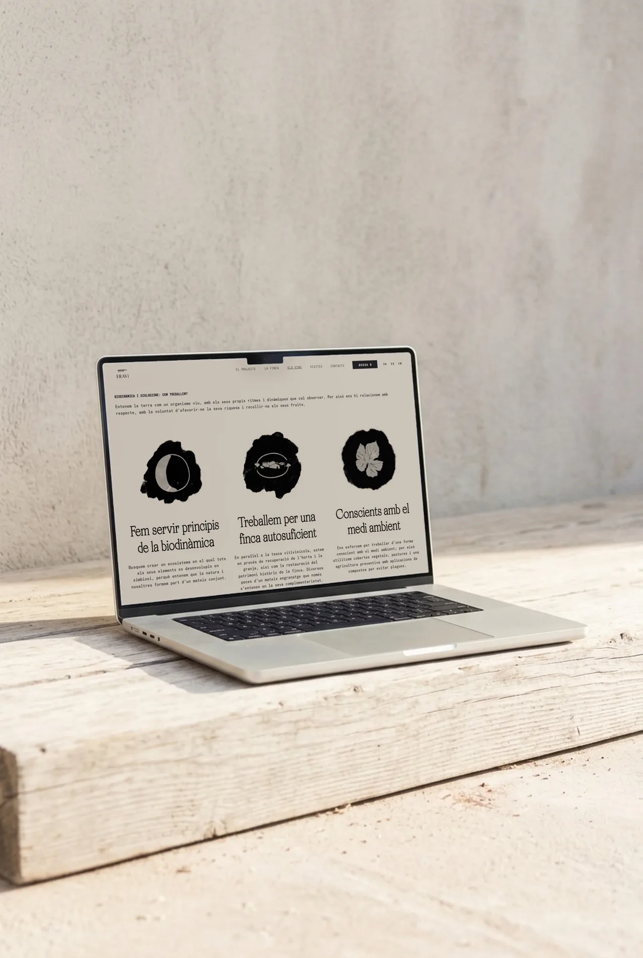
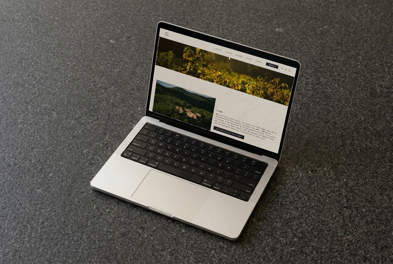
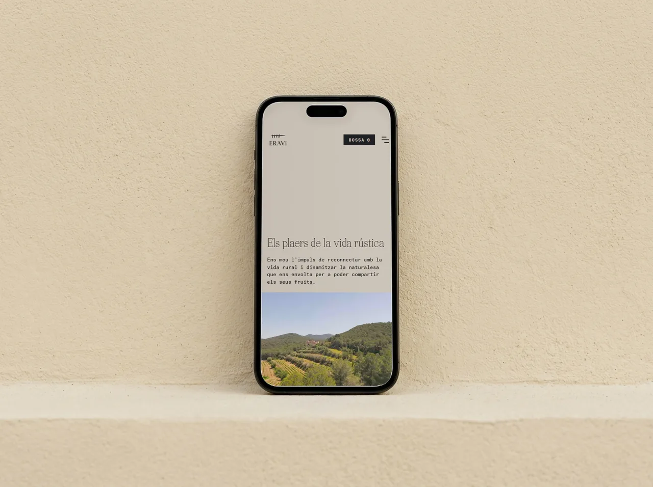
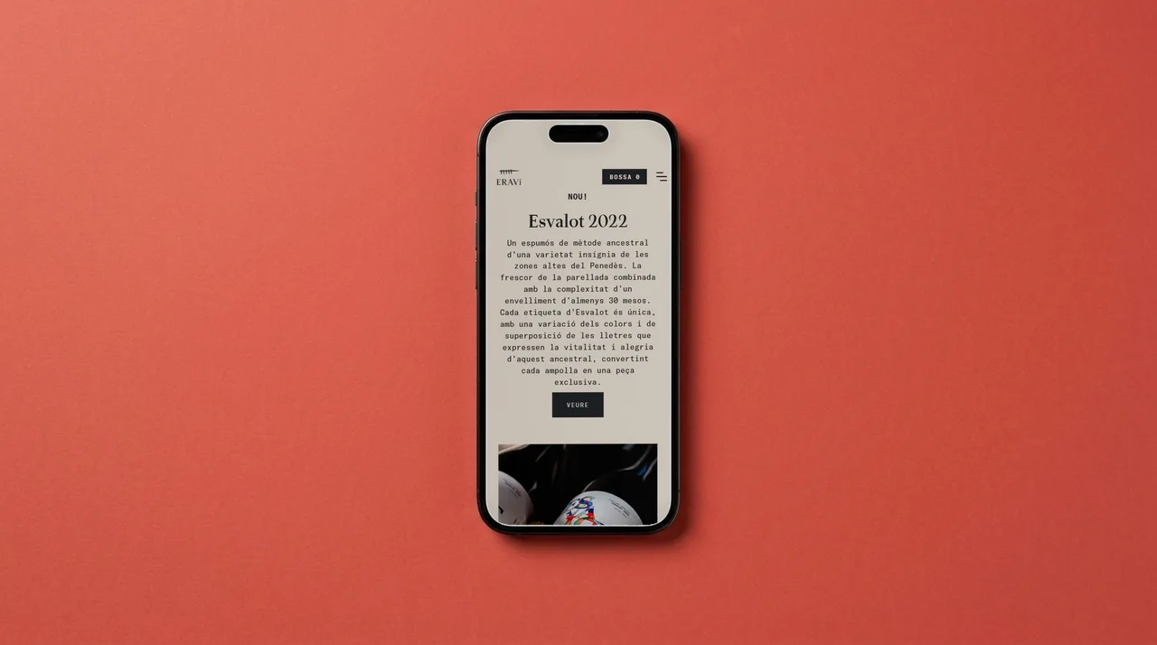
We later developed the ERAVi website, which complements that ethos. The design blends tradition and modernity: the home page combines the logo with a photo of the winery among the vines, and it highlights the winery’s sustainable practices and its dedication to quality.
The result
ERAVi has an identity that reads on the bottle, the cork, the back label and the screen. The timeline and the vines give it a story that is simple to tell and easy to recognize, and the website strengthens the brand and reaches a wider audience, sharing the story and the passion behind conscious winemaking.
For the studio this is a representative project of what we do with wineries: tying logo, label, packaging and website together with a single judgment, so every piece says the same thing. If you run a winery going through a change, a generational handover or a new range, we can work on it from the concept all the way to the printed label and the website.
Service: Brand identity and naming · Packaging and wine labels · Web design