Audit software branding and UI design: Datum
Naming, visual identity and multi-device interface design for Datum, a data-analysis audit program: a complex tool designed to be functional and intuitive for managers and auditors alike.
- Client
- Buisi Tools
- Year
- 2022
- Location
- Esparreguera
- Services
- Naming, Visual identity, UI design
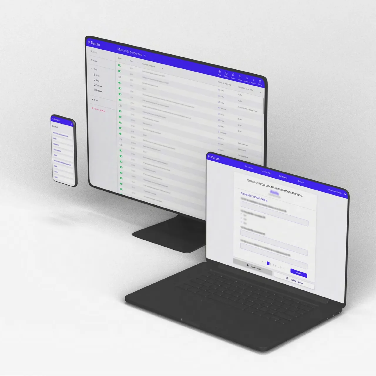
Datum is an audit program by Buisi Tools, a company based in Esparreguera near Barcelona, focused on the precision and efficiency of data analysis. This is a case of audit software branding and UI design: we named the product, drew its brand and designed its interface so it works equally well on a monitor, a laptop and a phone.
The challenge
An audit program deals with a lot of data, a lot of fields and a lot of settings. The tool exists to give a detailed view that supports better-informed decisions, and that only happens if the people using it do not get lost along the way. The challenge was twofold: a brand with its own name and a clear image, and a highly complex interface that had to be functional and intuitive for everyone involved. On the other side of the screen there are two different profiles, managers and auditors, and each of them needs to find what they are looking for without effort.
The process
We started with the name. “Datum” comes from the Latin for “given,” a piece of data, and we liked the singular: it stresses the importance of each individual element and the tool’s capacity for precise analysis, one data point after another.
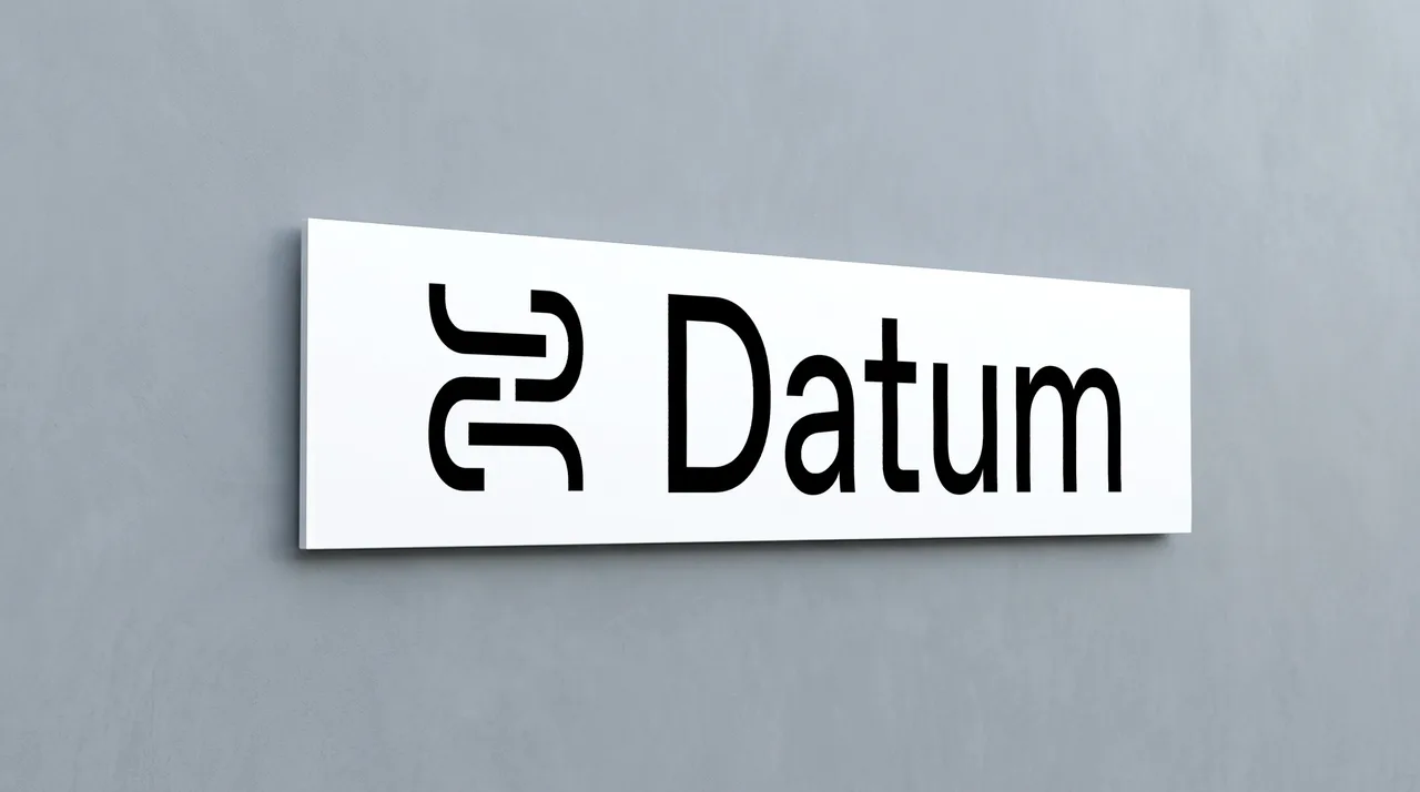
The logo and identity start from the idea of a system, of connections and of technology. We built the initial, the D, into the icon to get a clean image that is easy to understand. The pieces show how it works: the logo in white with its icon on an electric blue background, and the app icon, with its stylized D, on blue. Blue and white give a calm, precise look to a tool that has to inspire trust.
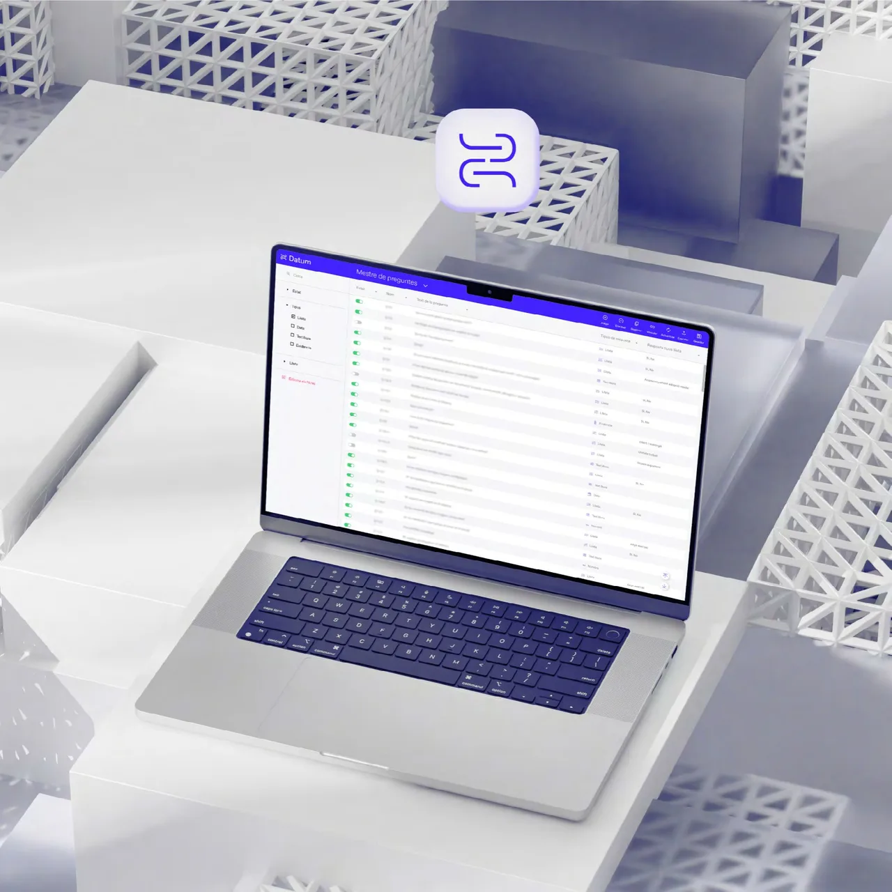
For the UI and UX we took a user-centered approach, considering managers and auditors alike. The mockups show a data table with filters in a side panel and a blue header carrying the main actions, designed so that large amounts of information can be read, sorted and edited with a clear hierarchy. We worked on the interface for desktop, laptop and phone, so the same logic and the same look carry over to any device.
The result
Datum now has a complete brand, with a name, a logo, an app icon and a blue and white visual system, plus a multi-device interface that brings order to a very complex tool. The image is clean and easy to read, and the interface puts function ahead of decoration.
For us it is an example of how brand judgment also applies to a digital product: the name, the icon and the data table all grow from the same idea. If your project is software, an internal tool or a platform that needs a name, an identity and an interface at once, we can work on it from the start and as a single system, keeping an eye on the people who will use it every day.
Service: Brand identity and naming · Web design