Tutoring center branding and website: Acadèmia Aprèn
An evolution of Acadèmia Aprèn's identity that keeps its logo: a new palette, geometric shapes, a website built around families' questions, a new street sign and window vinyls, and ongoing posters.
- Client
- Acadèmia Aprèn
- Year
- 2026
- Location
- Vilafranca del Penedès
- Services
- Visual identity, Web design and development, Signage, Posters
- Materials and production
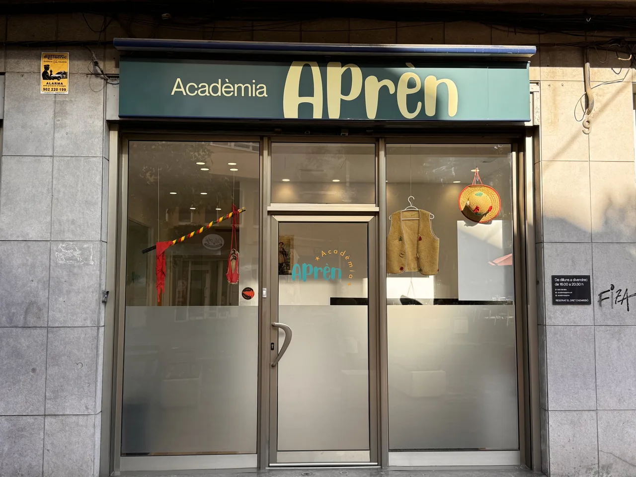
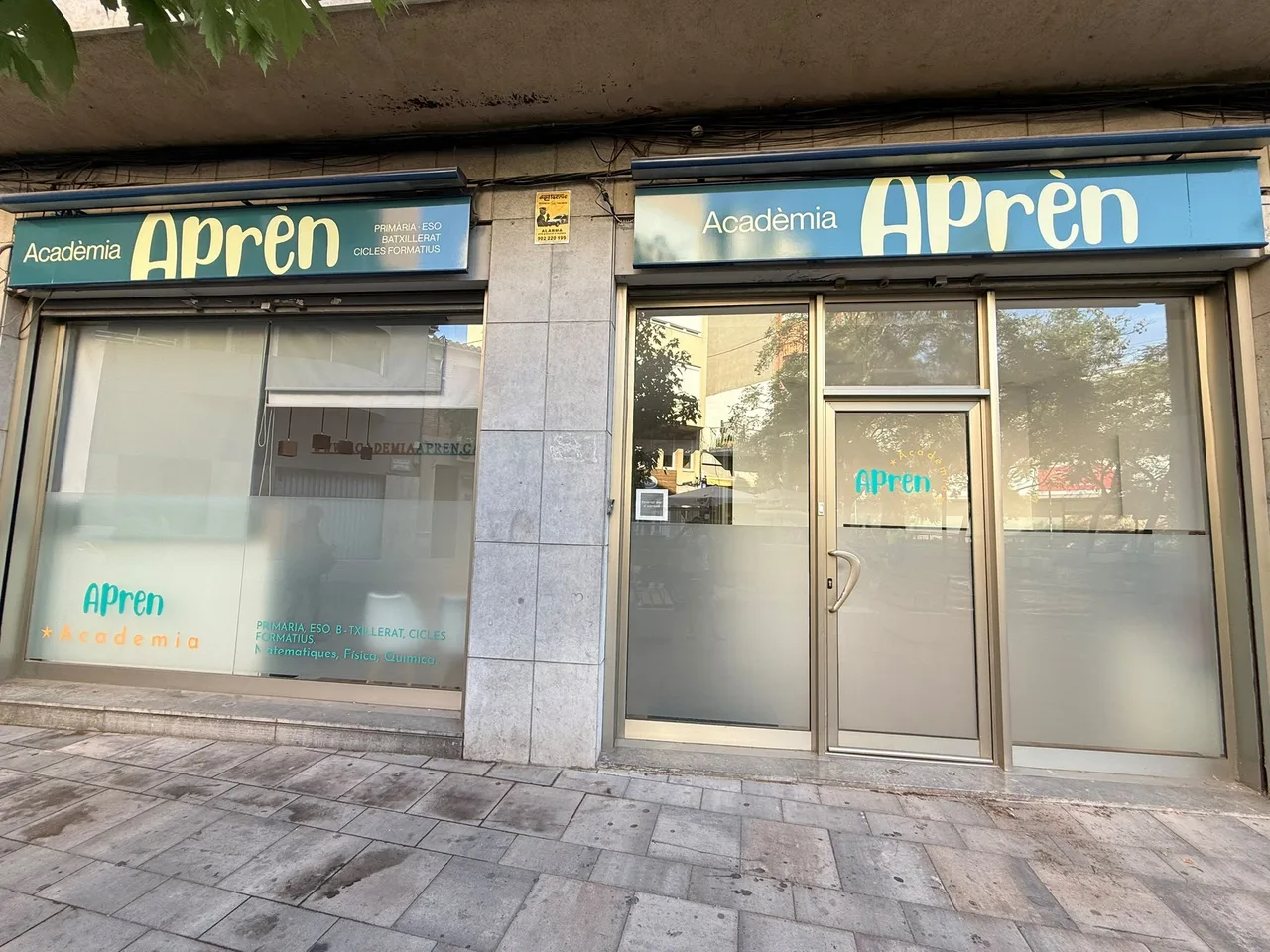
- New street sign and frosted window vinyl
Acadèmia Aprèn is a tutoring and private classes center on Plaça del Triangle in Vilafranca del Penedès, a town in Catalonia’s wine country. This is a tutoring center branding and website case: how we renewed the image of a small business, from the storefront to the phone screen, without losing the recognition it had with families.
The challenge
The academy came to the studio after a change of ownership. It started from a homemade image typical of a small business, and a standard white sign that said nothing about what happened inside. Families who already knew it had to keep recognizing it, and new families had to find quick answers to the questions they ask before enrolling a child in tutoring.
The process
The decision was to evolve without breaking with the past. We kept the logo, because it is what families already identify, and built a new identity around it: a renewed palette (dark green, turquoise, yellow and orange) and a set of geometric shapes that give structure and energy to every item.
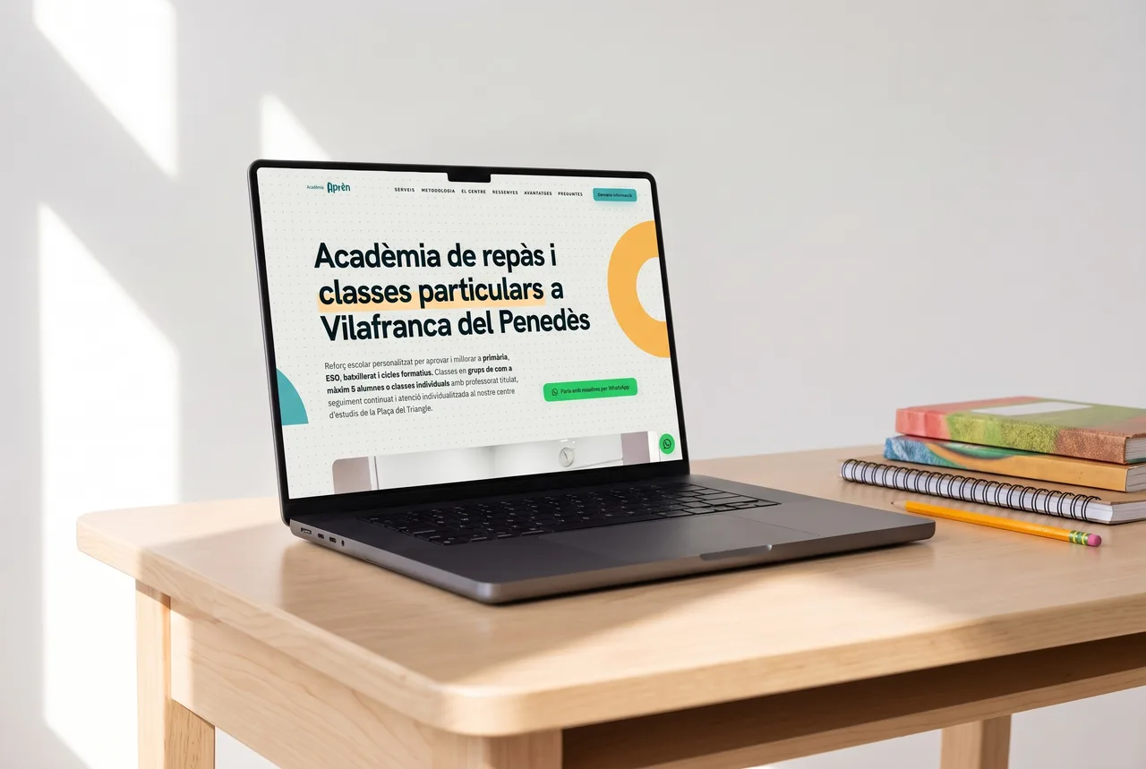
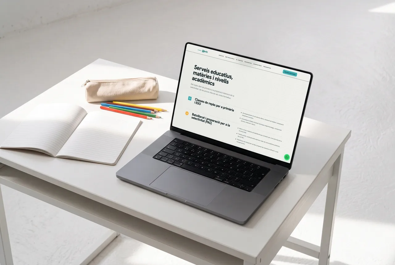
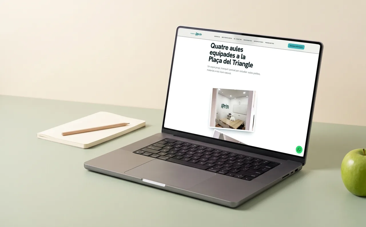
The most important piece is the website, which we designed and developed in-house. It answers families’ questions in the order they ask them: why this academy, which services and levels, how the teaching works (groups of five students at most), which classrooms, what other families say and how to enroll. The home page is shown on a laptop on a study desk, the services page lays out subjects and levels, and another page presents the four classrooms. The new palette and shapes make it warm and approachable, and WhatsApp contact is always one tap away.
At street level, we replaced the neutral white sign with a new one carrying the renewed identity, and lettered the windows with frosted vinyl explaining levels and subjects. Anyone walking across the square now knows what happens inside before stepping in.
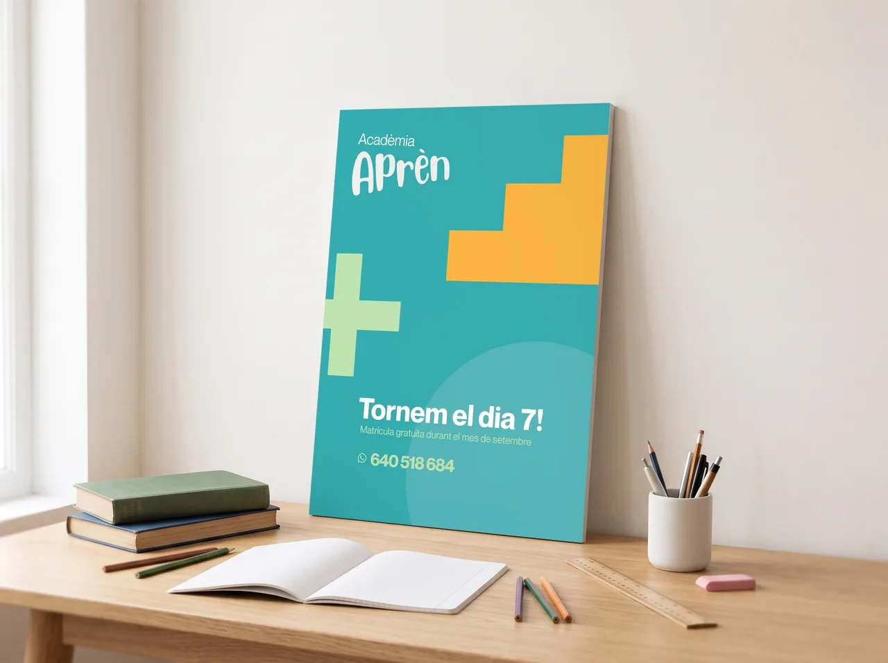
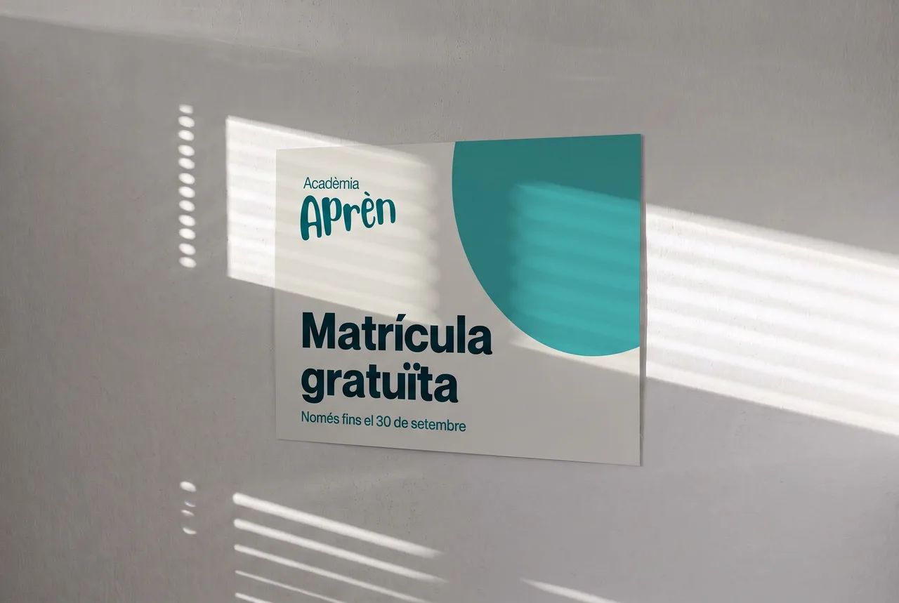
We also designed posters for specific moments of the school year, such as the “Tornem el dia 7!” poster (we’re back on the 7th), in turquoise with geometric shapes, and the “Matrícula gratuïta” poster (free enrollment), made to hang on a wall.
The result
The result is an academy that keeps its familiar face but no longer looks improvised. The same language of color and shapes repeats on the facade, the windows, the website and the posters, and tells families, before and after they walk in, that this is an organized and friendly place.
We continue to work with the academy on posters, signage, social media and whatever else comes up. For the studio, it is a good example of how an identity can serve a neighborhood business without losing its human scale. If you have a business that has changed hands or needs its image brought up to date, we would be happy to talk.
Service: Brand identity and naming · Web design · Festival and event design