AI company brand identity: INNOVA
Visual identity for INNOVA, an artificial intelligence technology company: a geometric, angular look, a typeface built on Nudica Mono and an electric scarlet set against neutrals.
- Client
- Innova
- Commissioned by
- La Fatxenda
- Year
- 2024
- Location
- Vilafranca del Penedès
- Services
- Visual identity
INNOVA is a technology company that puts artificial intelligence and innovation at the service of society. This is an AI company brand identity case: how we built a brand that is rigorous and bold at once, with visual judgment and without science-fiction clichés.
The challenge
The artificial intelligence sector is full of brands that look alike: blue gradients, neural networks, brains made of light. INNOVA wanted an identity that captured its rebellious, visionary character while conveying scientific precision and a humanist approach. Three things that often contradict each other: being bold, being rigorous and being approachable. The brand had to work as well on a screen as on a physical object, such as a van or a tote bag.
The process
We started from a geometric, angular aesthetic, with straight lines and calculated proportions that evoke advanced technology. This is the visual language of the brand, and it holds across every element.
The corporate typeface is based on Nudica Mono with custom adjustments. It is bold and legible, optimized for digital environments, and its monospaced foundation nods to code without turning the brand into a programmers’ joke.
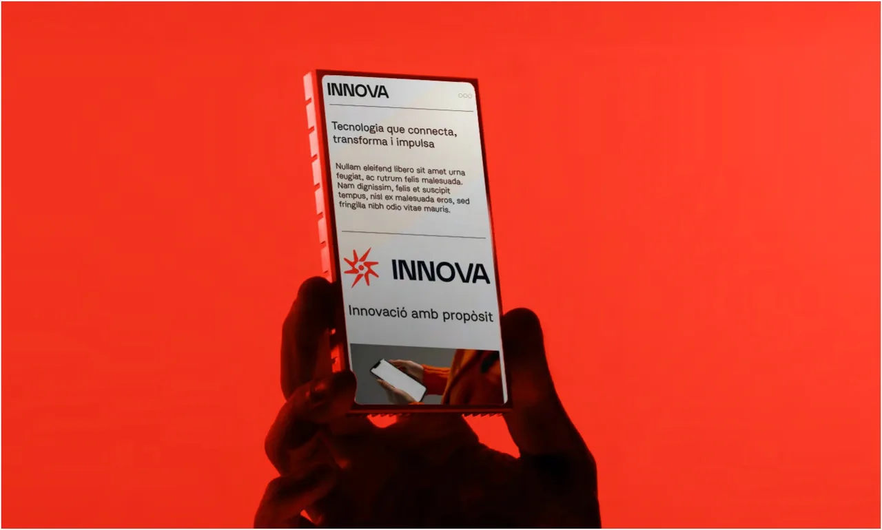
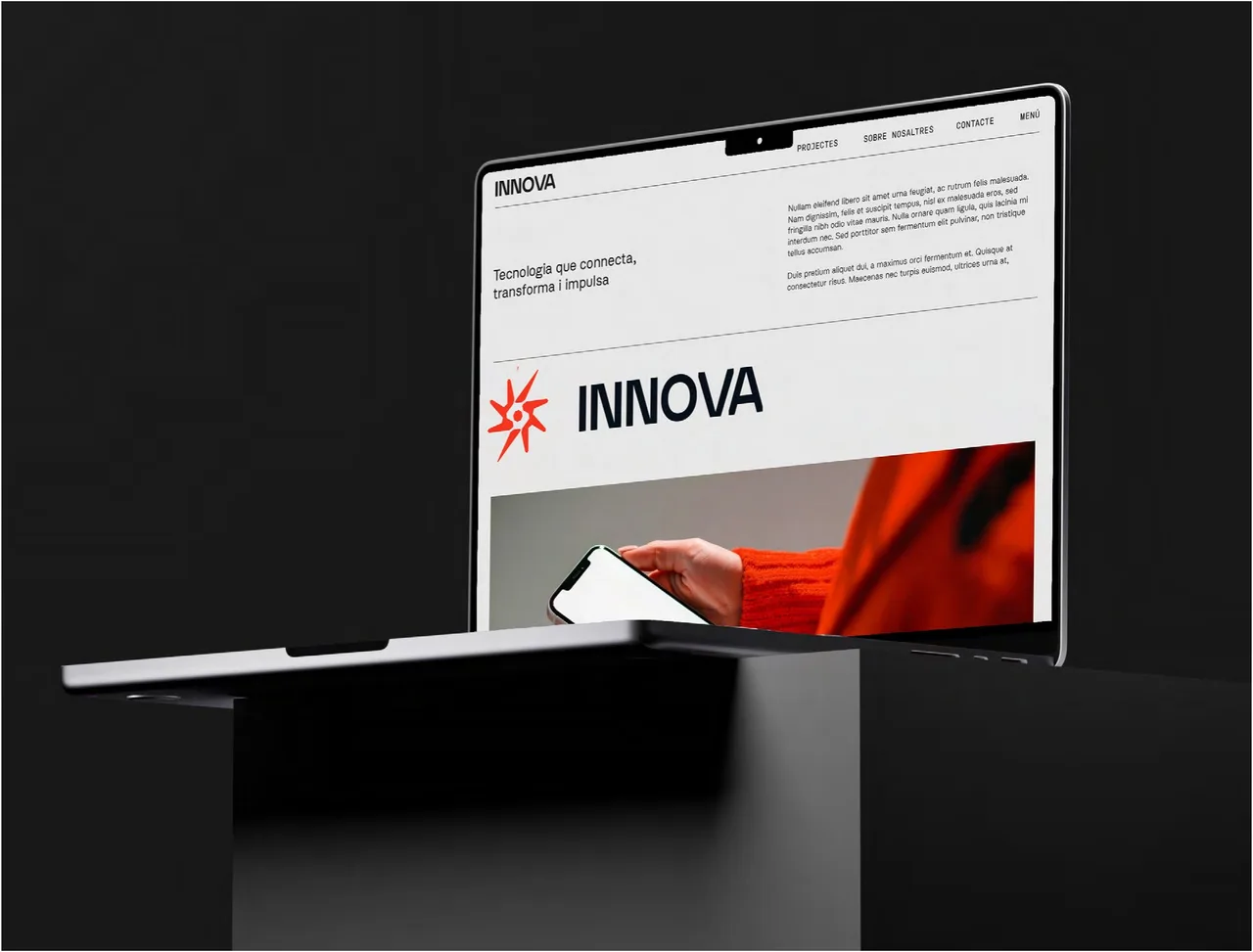
The palette pairs neutrals, which bring sophistication and balance, with an electric scarlet that injects boldness. The red is not a background repeated everywhere: it is the accent that makes the brand recognizable. You can see it behind the cover photograph, where a hand holds a phone showing the INNOVA website.
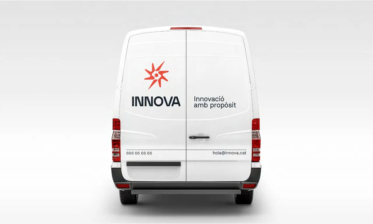
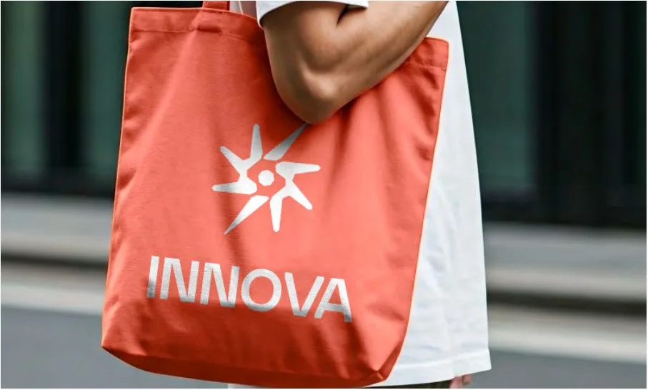
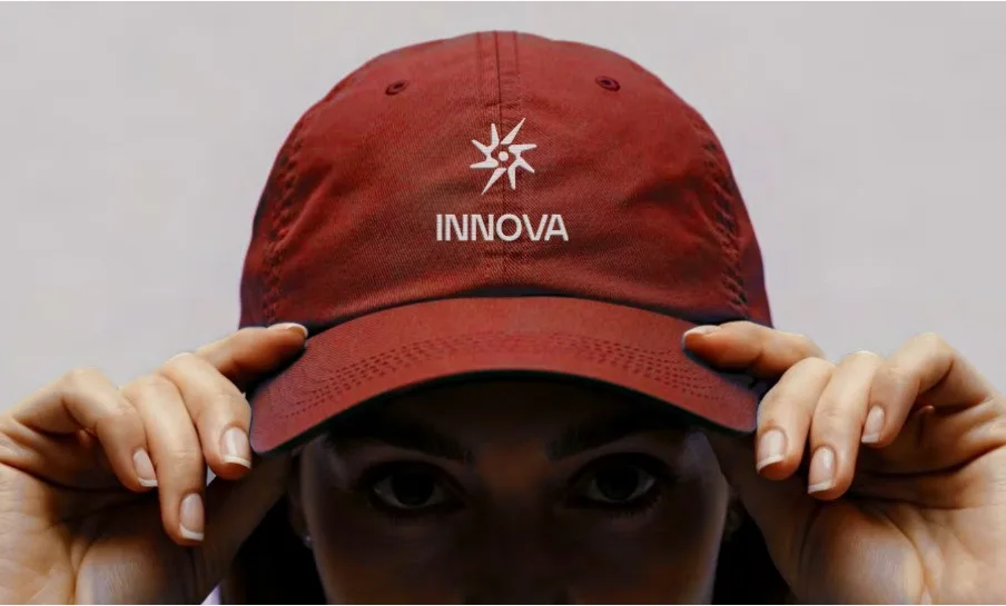
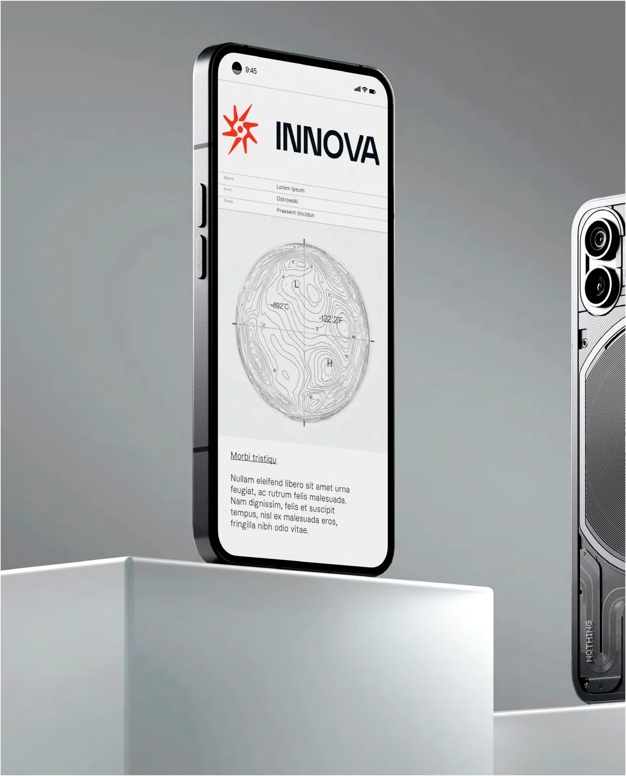
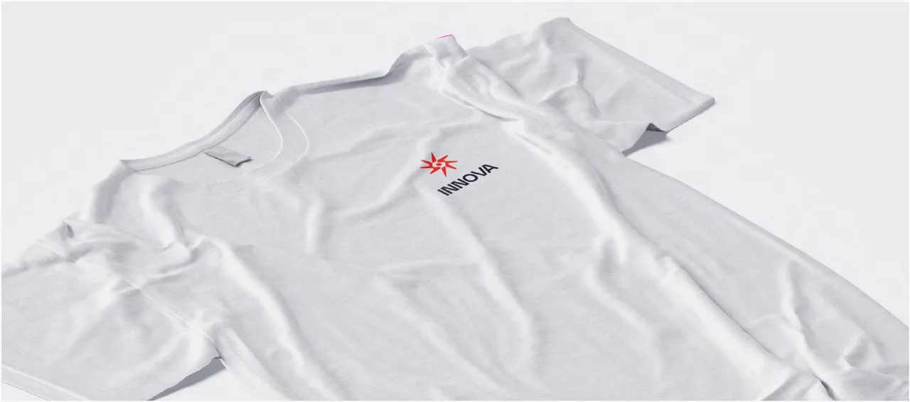
The symbol is built from interconnected geometric structures and stands for connection and evolution. It is simple enough to embroider on a red cap, print on the chest of a white T-shirt or set on a red tote bag next to the white wordmark. It also appears on the rear of a white van, alongside the brand’s tagline, and on the website, shown on a laptop and a phone.
The result
The result is a powerful, distinctive identity for a technology brand with a purpose: to connect, transform and drive forward. The same geometric logic reads in the symbol, in the typeface and in the contrast between neutrals and scarlet, which lets the brand stay recognizable on the web, on apparel and on vehicles.
For the studio, it is proof that a technology company does not need generic design to look technological. If you are launching an AI or software company and want an identity that does not look like the rest, we would be glad to talk.
Service: Brand identity and naming