La Gueralda, an anniversary poster series for a community center
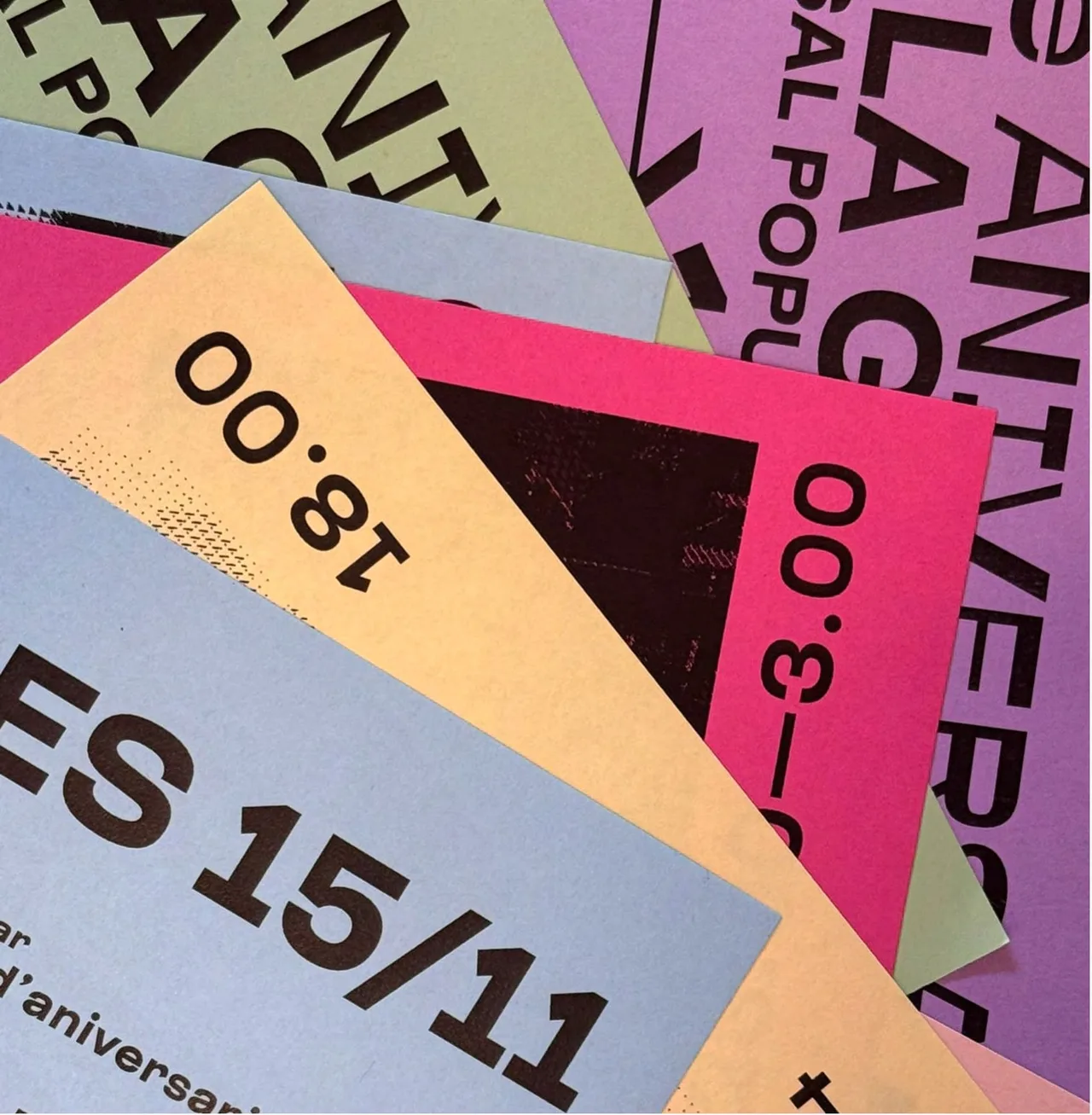
Identity for the tenth anniversary of La Gueralda, Vilafranca's community social center. Overlapping single-ink posters on pastel paper evoke a space that is always on the move.
- Client
- La Gueralda, Casal Popular de Vilafranca
- Year
- 2024
- Location
- Vilafranca del Penedès
- Services
- Visual identity, Events
- Materials and production
- Pastel-colored paper and a single ink
- Collaborators
- Cristina Gallardo (il·lustracions)
For the tenth anniversary of La Gueralda, Vilafranca’s community social center, we designed an anniversary poster series for a community center that never stops: posters that pile up, overlap and make the activity of a living space visible.
The challenge
La Gueralda was celebrating ten years as a reference point for culture and collective struggle. A casal popular is a self-managed community center, common in Catalan towns, run by neighbors and open to the community. The commemorative project had to reflect a living place, where people organize themselves and run events all year round. It is not a venue with a fixed program: something new happens every week, and the image had to show that.
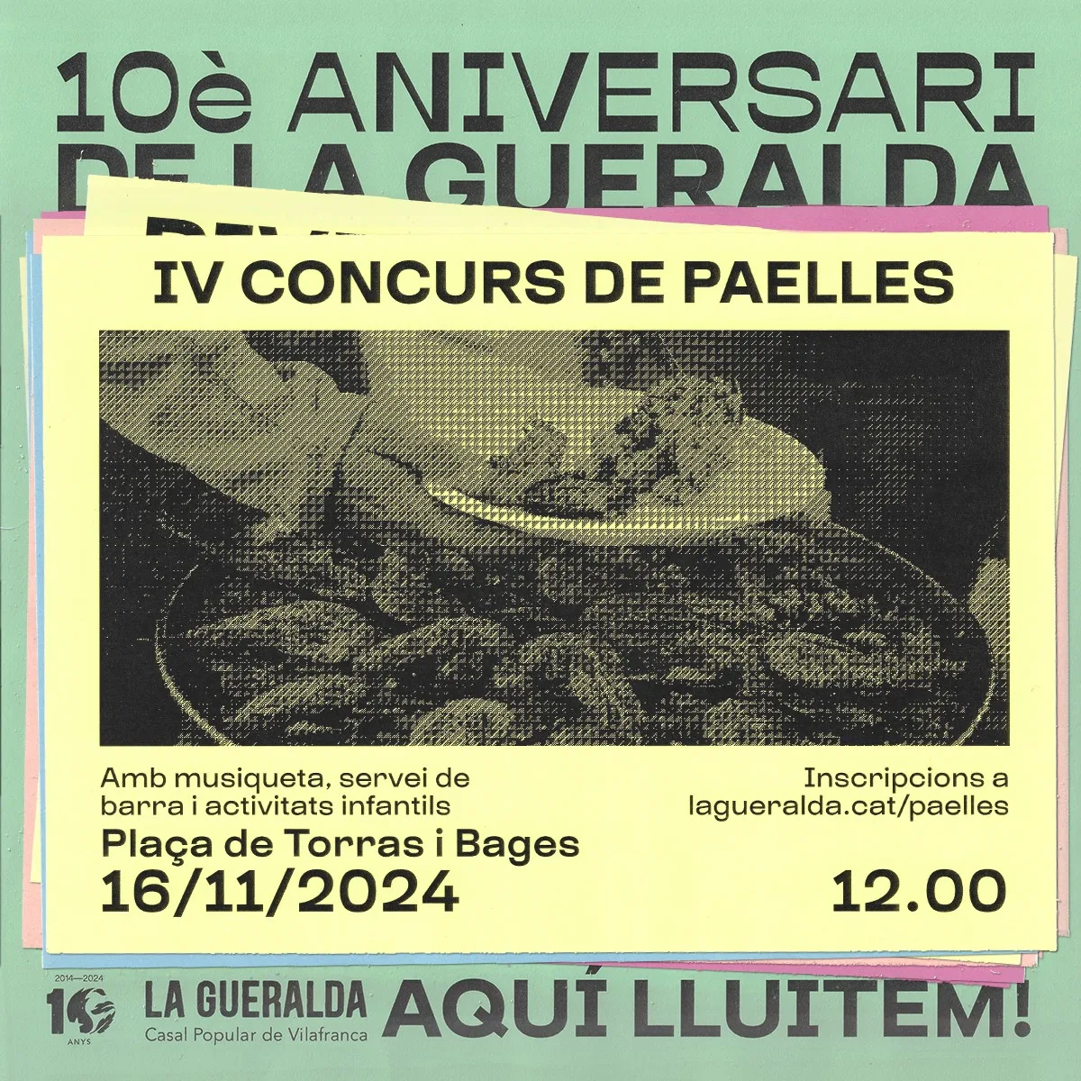
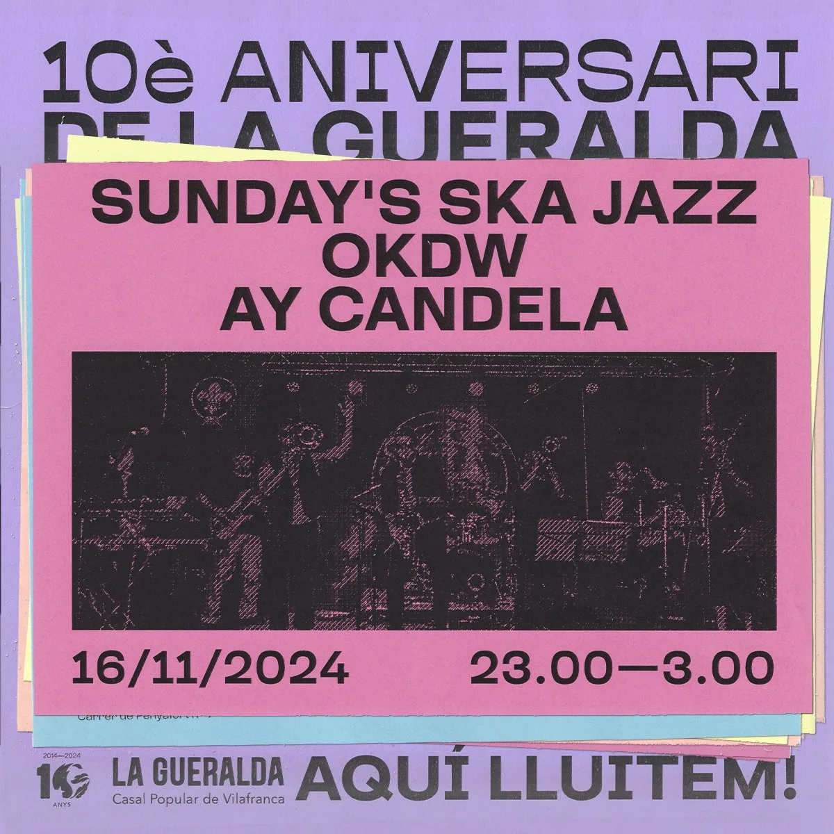
There was also a clear starting condition: the budget of a grassroots organization is tight, and the campaign had to have visual impact without relying on a big production. The anniversary was celebrated from November 15 to 17, 2024, and the program included workshops, concerts, shows, a paella contest and a swap market. All of it had to be communicated with one shared image.
The process: posters that overlap
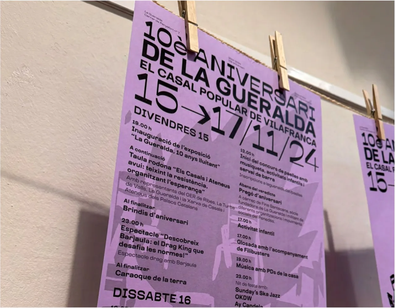
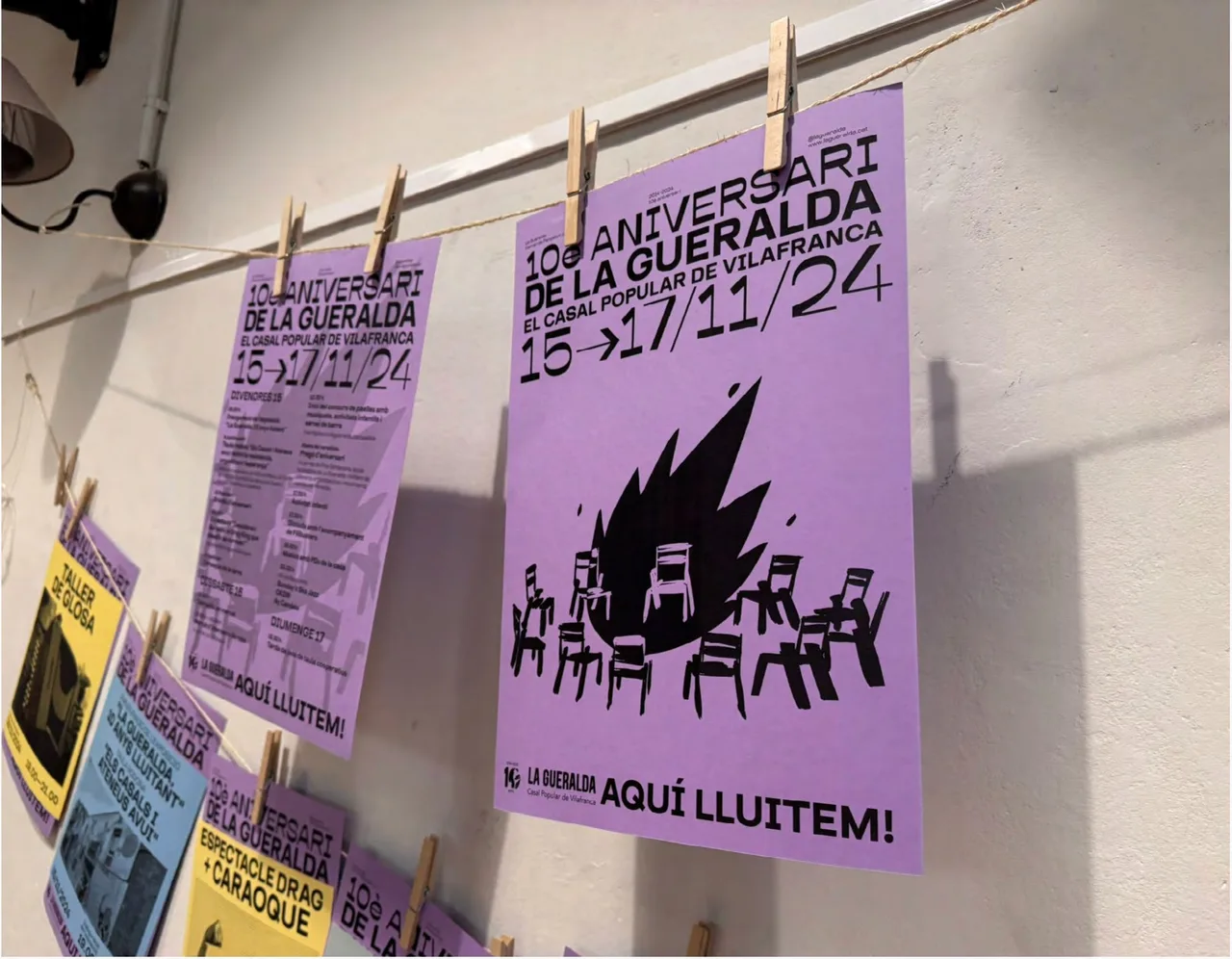
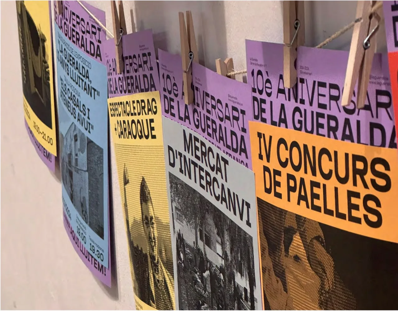
We built the identity around visually strong posters, in print and online. Inspired by the constant activity of the center, the concept starts from layering posters on top of one another, evoking a space that never stops moving. The posters hang from a line with wooden pegs, one over another, the way they would on any wall in a place like this.
The main poster carries the title “10è Aniversari de La Gueralda” in large, black grotesque lettering, the dates with an arrow (15 → 17/11/24) and an illustration in a thick, hand-drawn line: a bonfire with chairs around it, an image of gathering and community. At the bottom sit the 10th anniversary logo and the slogan “Aquí lluitem!” (“Here we fight!”). The rest of the posters in the series, one for each activity (workshops, concerts, shows), share the same typographic system and change color.
The printed materials were produced on pastel-colored paper (lilac, yellow, blue, green) in a single ink, which kept the budget in check without losing visual impact and reinforced the idea of a sustainable project rooted in the values of the center. Black on colored paper has strong contrast and reads from a distance, and when the posters overlap, the large single-ink typography stays legible.
The result
We delivered a vibrant, coherent identity that celebrates a decade of commitment to popular culture and collective work. The series works both as a single poster, as the image of the anniversary, and as a whole, when posters hung from a string form a changing mural that shows everything happening at the center.
This project shows an approach we care about: start from a real limitation, such as doing everything in a single ink, and turn it into the design concept. What could have been a restriction becomes what makes the campaign recognizable, while staying true to the values of the organization.
Service: Brand identity and naming · Festival and event design