Esvalot, generative wine label design for ERAVi
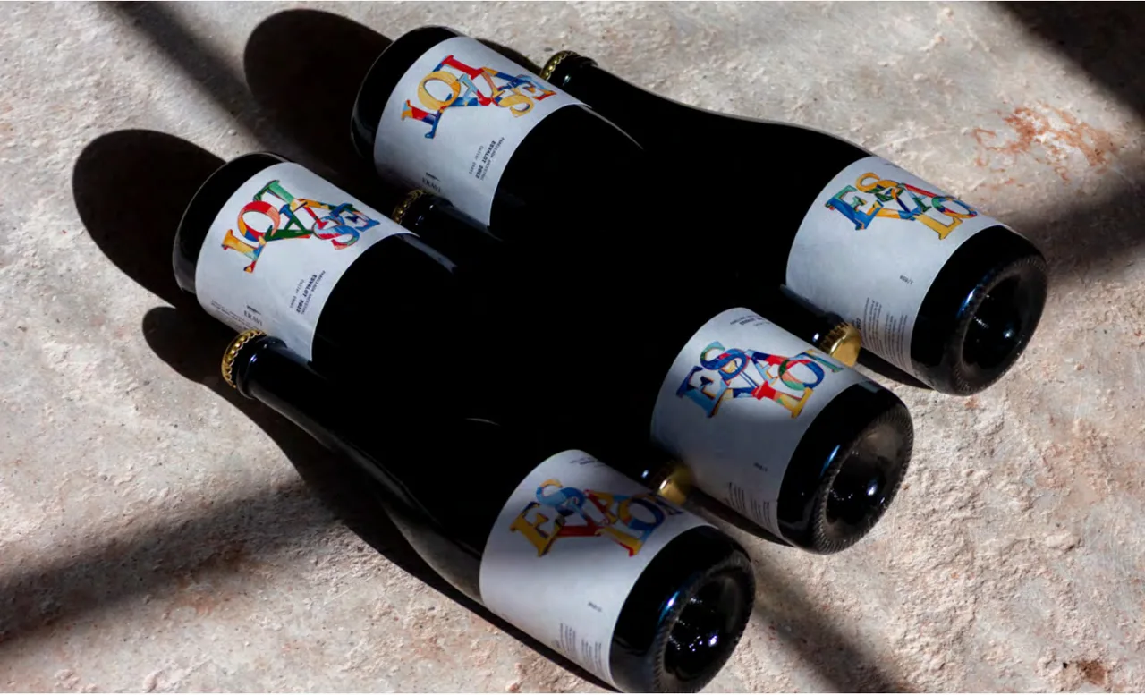
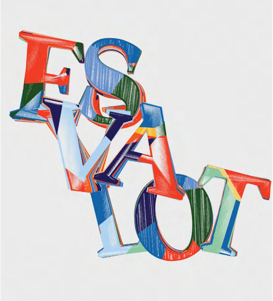
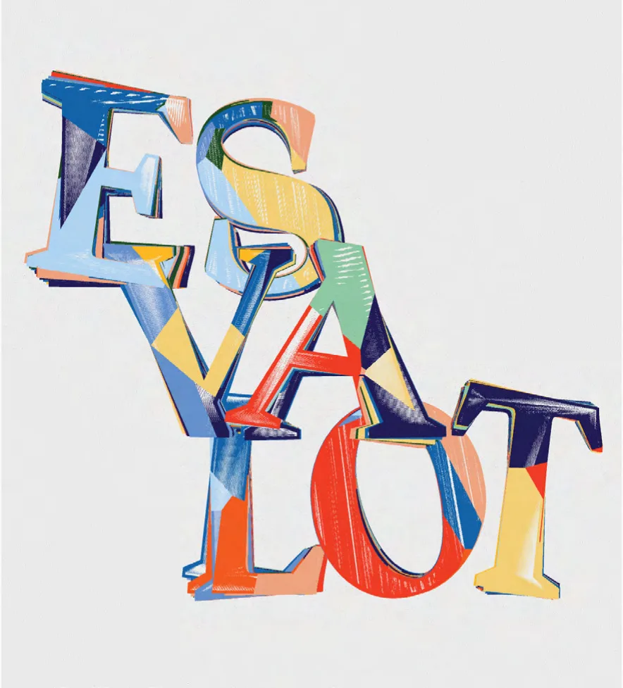
Label for ERAVi's Esvalot ancestral sparkling wine. A generative process gives every bottle its own typographic composition, just as fermentation never repeats itself.
- Client
- Celler ERAVi
- Year
- 2025
- Location
- Penedès
- Services
- Packaging
Esvalot is the ancestral Parellada from the ERAVi winery in the Penedès, and its generative wine label design is how we told the story of the wine: clear rules, and a result that is different every time.
The challenge
“Esvalot” is Catalan for uproar: movement, energy, joy and celebration. It is a name with a lot of weight, and the label had to make its spirit visible without turning into a party illustration. The Penedès is the wine and cava region southwest of Barcelona, and ERAVi is a small winery there, revived by a young winemaker who works with respect for the environment. It needed a piece that stands out on a shelf and explains the product by itself.
There was a second, deeper issue. The fermentation of an ancestral wine never repeats itself. Every bottle develops in its own way, so one identical label for all of them seemed to contradict the idea.
The process: a label that never repeats
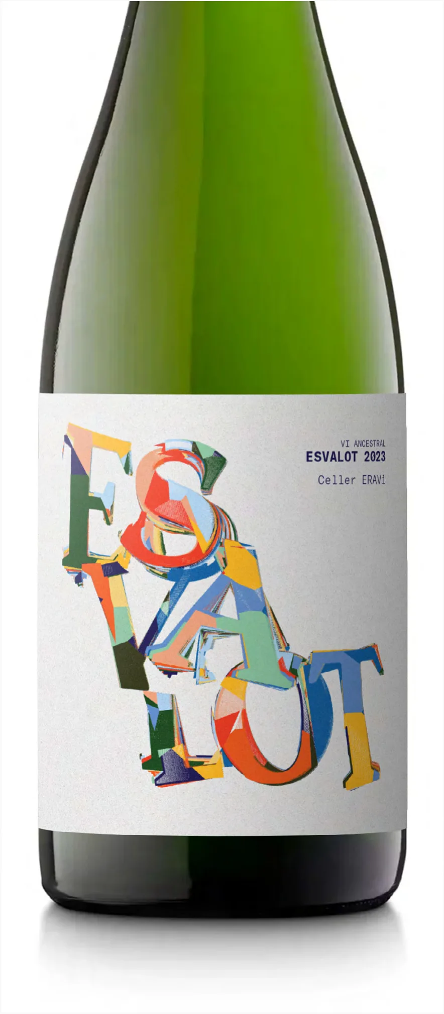
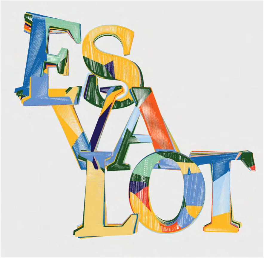
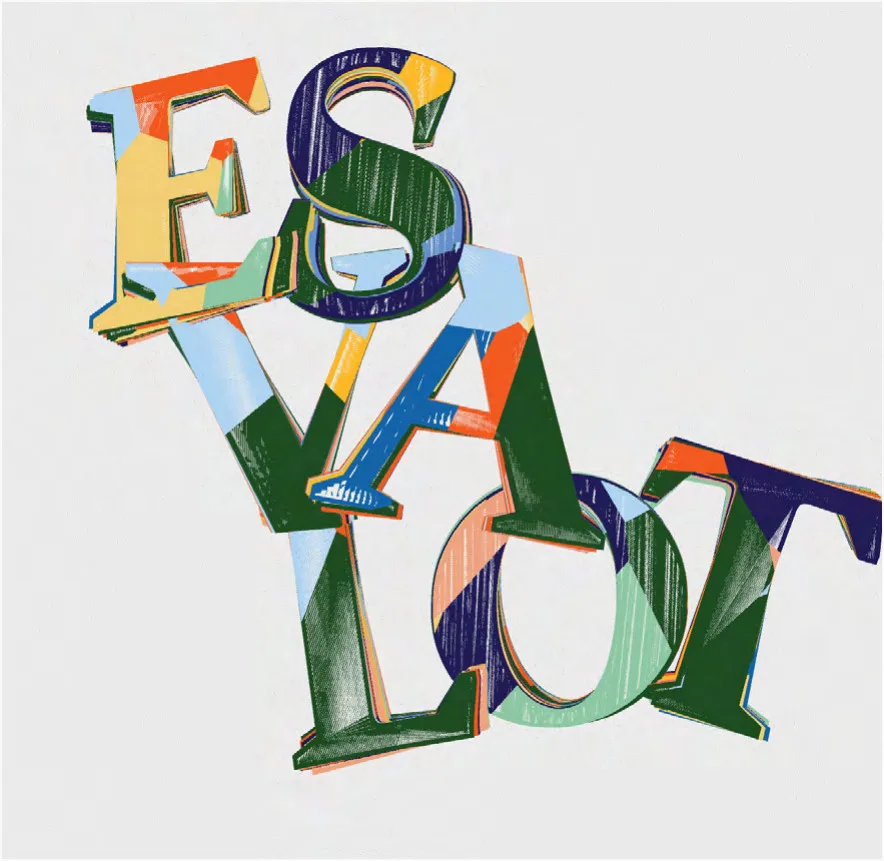
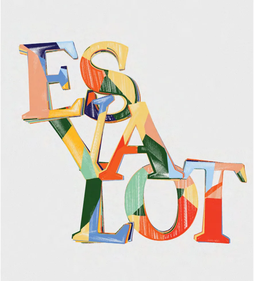
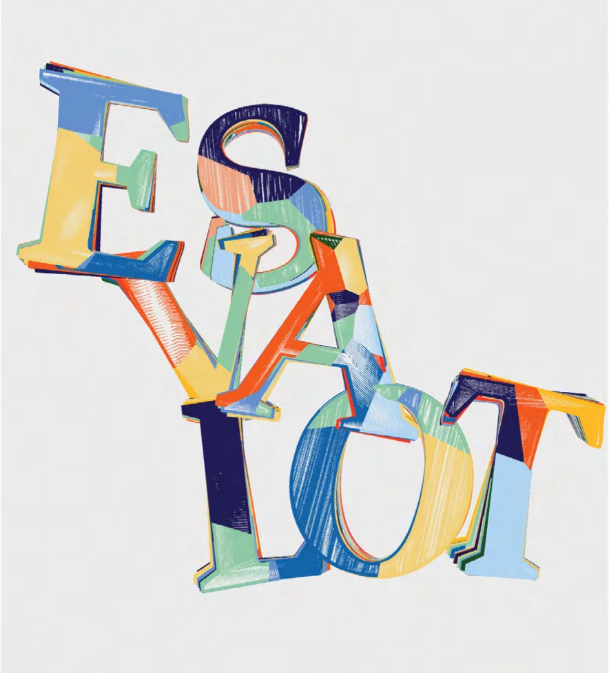
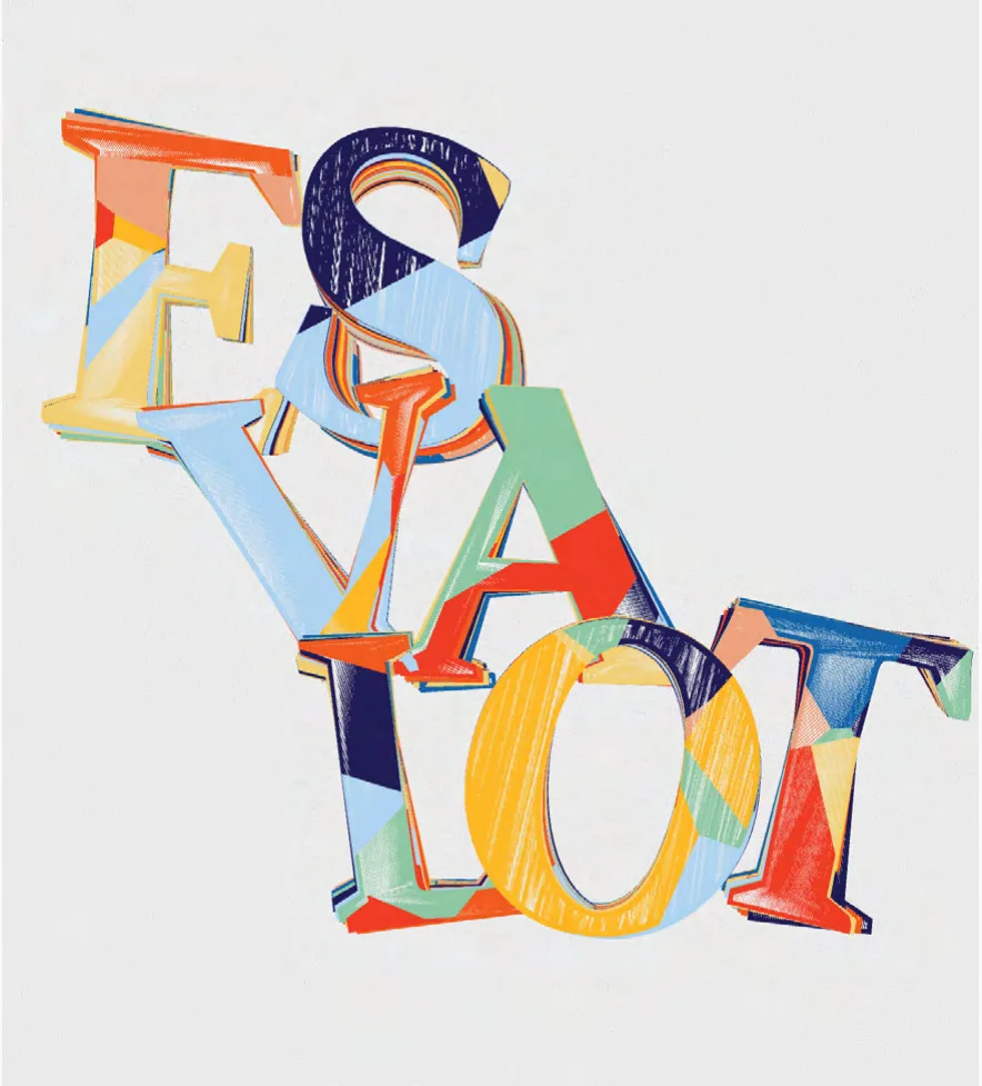
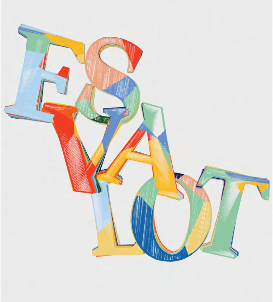
We started from the word itself. The Esvalot composition breaks the name into large blocks of letters (ES, VA, LOT), stacked and overlapped, playing with each other through repetition and transparency. The letters are classic roman forms, filled with fragments of color: blues, yellows, reds, greens and pastel tones that cross over each other like a collage.
On top of that base we built a custom process that generates random variations. The system follows set protocols, just like winemaking, but the final outcome cannot be predicted. So every label in the run is a different version of the same drawing. The gallery shows some of these variations: some dominated by dark green, others in red and navy, in orange and blue, or in pastels.
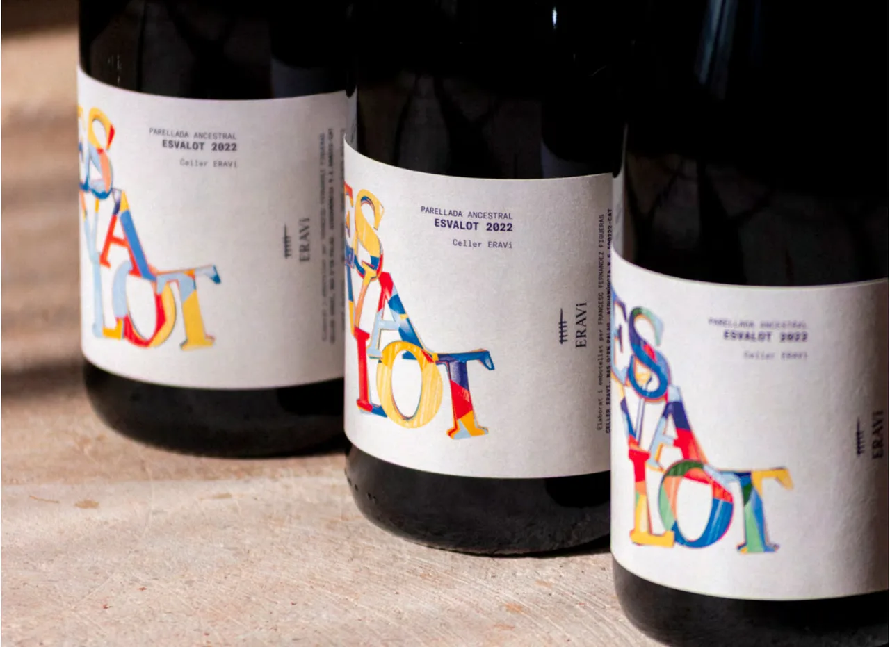
Everything around the composition stays quiet. The information (ancestral Parellada, Esvalot 2022, Celler ERAVi) is set in a small, technical-looking typeface, aligned to the left, and the ERAVi logo runs vertically along the edge. The label is white with a matte look, so the color of the letters is the only loud element against the dark glass of the bottle.
The result
Each bottle of Esvalot is an individual piece within a collection. Put three bottles side by side and you see at once that they come from the same system and that no two are alike. That singularity gives the product an exclusive character, adds value to the bottle and makes it special for whoever opens it. It also gives the winery something easy to recognize and remember.
It is a good example of how we approach packaging for local producers: start from the real process behind the product, turn it into a specific design decision, and apply it systematically. Here the decision was that the same fermentation that makes every bottle different would also make every label different.
If you have a wine, an olive oil or any product with a process of its own that deserves to be told, the packaging is the place to do it.
Service: Packaging and wine labels