Theater school website: Artèria
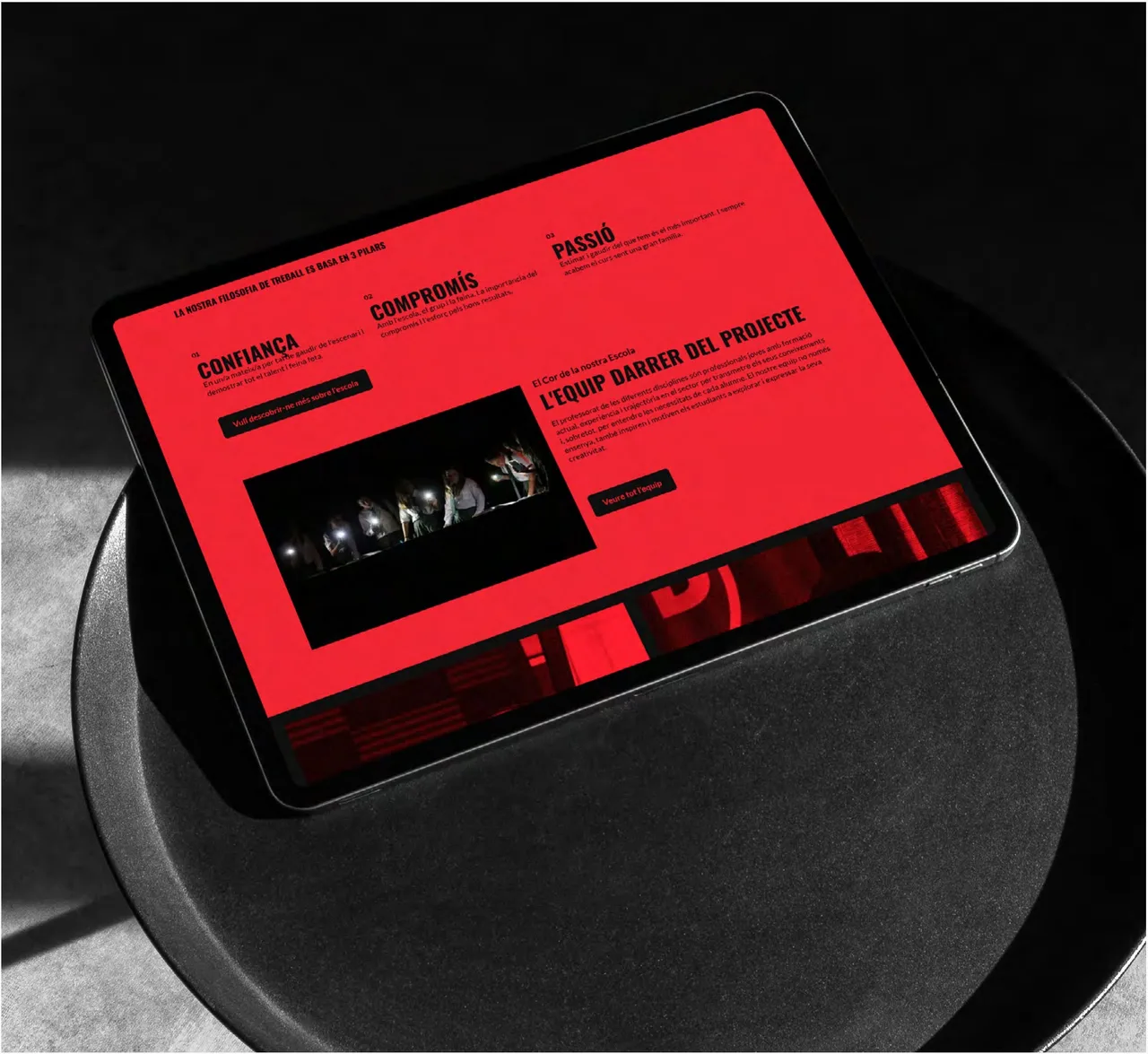
Website for the Artèria theater school, built on intense red and black and a heavy condensed typeface that brings order to the school's vibrant chaos.
- Client
- Escola de Teatre Artèria
- Year
- 2024
- Location
- Vilafranca del Penedès
- Services
- Web
Artèria is a theater school in Vilafranca del Penedès, a town in Catalonia’s wine country. This is a theater school website case: how we built a site that speaks with the same energy as the school, while still organizing the information people need before they sign up.
The challenge
A theater school has a character that a neutral website cannot convey. Artèria is vibrant and disruptive, and its website had to show that from the first moment, not as decoration but as a way of speaking. But a website also has to do a job: people come to find out who teaches, what it costs and what the schedule is. The challenge was to keep the energy from swallowing the clarity.
The process
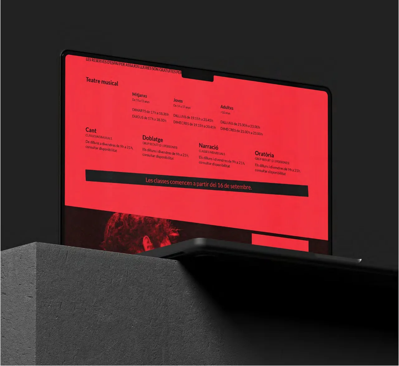
We started from a forceful color decision: intense red and black. Two tones, with strong contrast, and nothing else. Every element is designed to make an impact and convey energy from the first screen.
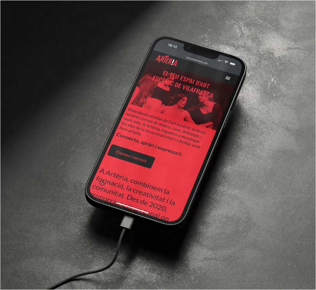
Typography did most of the work. We chose a heavy condensed typeface, which is at the heart of the experience: it builds a clear hierarchy that guides users through the content with force. Headlines are large and read at a glance, even on a phone. Negative space and a minimal use of color amplify the impact and bring order to the school’s vibrant chaos.
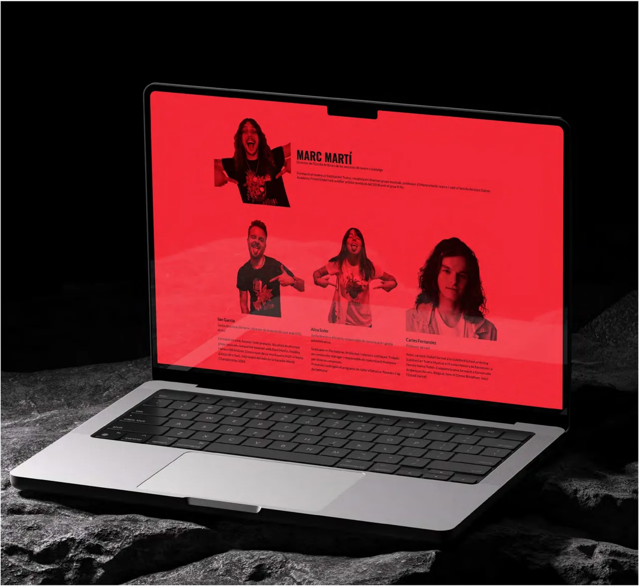
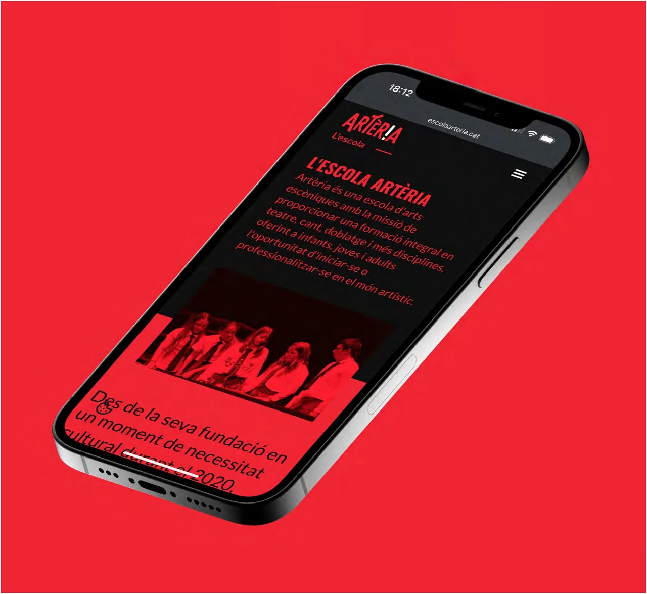
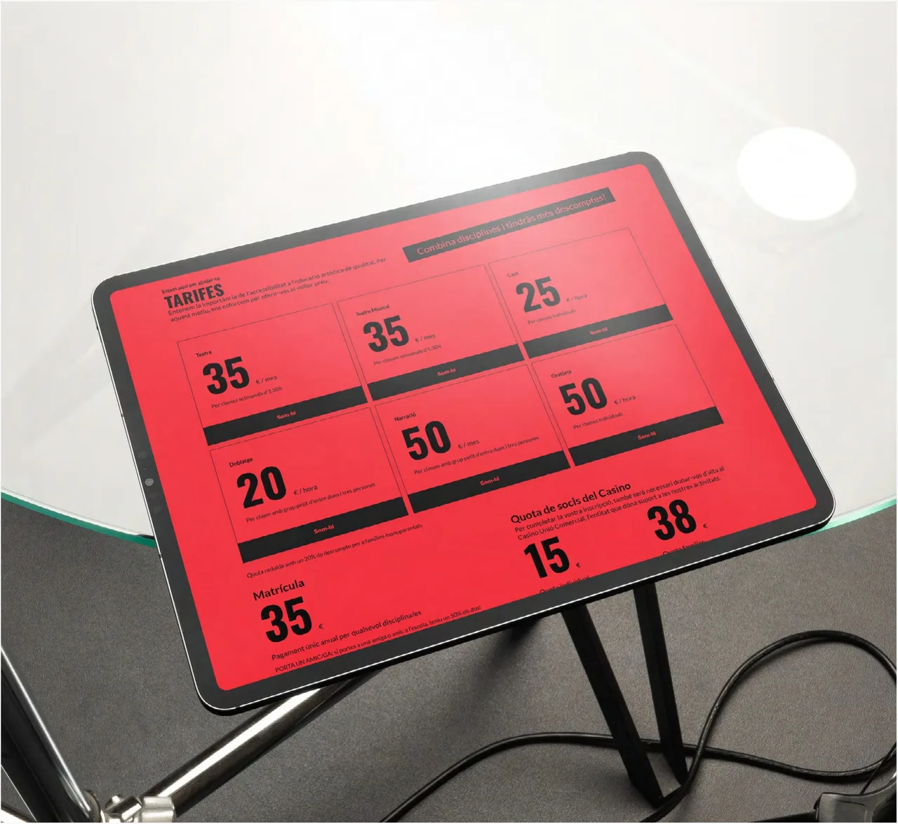
With this language we solved the pages a school needs. An introduction page for the school with text on a red background. A page for the teaching team. A fees page, where the figures are large against the red and can be read without hunting for them. And a schedule page with programming and times. All of it also works in the responsive mobile version, which is where many people check out a school.
The result
The result is a website that speaks with Artèria’s own voice, forceful and uncompromising, and turns the digital format into a way of expressing creativity. The hierarchy is clear: whoever lands on it knows where to look, and whoever only wants the price or the schedule finds it without effort.
For the studio, it is a project where typographic judgment does most of the design. With few elements and a lot of decisiveness, a school with personality can have a website that looks like no other. If you run a school, a company or a cultural space and want a website with a character of its own, we would be glad to talk.
Service: Web design