Running race branding: Vilafranca 10K
Identity for the Vilafranca 10K, a fast and technical race: italic type, diagonals cutting across the design, electric blue and electric lime, and a monospaced face for the details.
- Client
- Ajuntament de Vilafranca del Penedès
- Commissioned by
- La Fatxenda
- Year
- 2024
- Location
- Vilafranca del Penedès
- Services
- Visual identity, Merchandise, Social media
The 10K Vilafranca is a 10 km race held in Vilafranca del Penedès, the main town of the Alt Penedès district, in the wine country southwest of Barcelona. This is a running race branding case: how we built the identity for the 2024 edition, from the T-shirt to social media, so that it felt competitive, technical and easy to recognize.
The challenge
This is a race for people who want to compete, not a casual fun run, and the image had to say so. It needed to convey pace, speed and a touch of challenge, and it had to do it with a system that works across very different items: a T-shirt, the certificate for whoever reaches the podium, an Instagram grid and a results website. A race identity lives mostly in motion, among runners, so it has to read from a distance and on a small screen.
The process
We started with the shape of the letters. The type is set in italic, leaning forward like a body that is already running. On top of that we added diagonal lines that cut across the design. The diagonals bring movement and stand for the challenging nature of the competition: no item sits still inside its frame.
Color follows the same direction. The palette pairs electric blue with electric lime, two tones that charge the design with energy and stand out on the street. For the details (data, times, figures) we chose a monospaced typeface, which suggests the technical precision of a stopwatch and balances the energy of the italic.
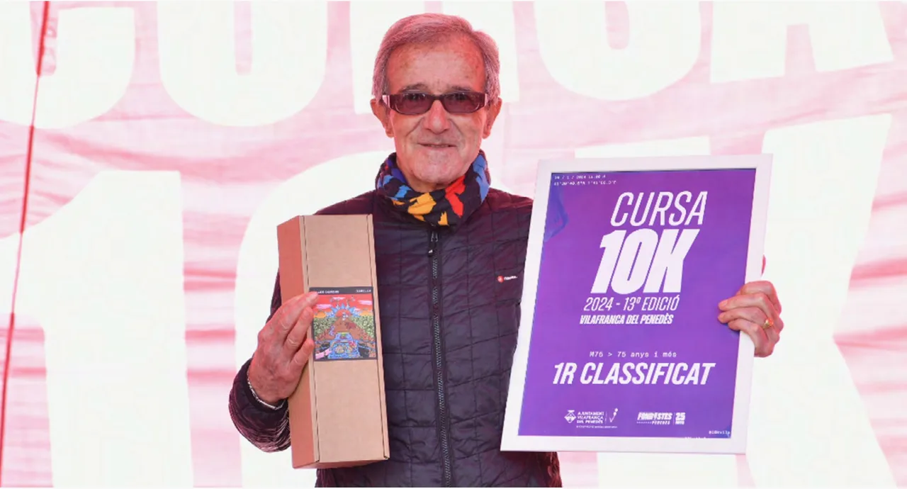
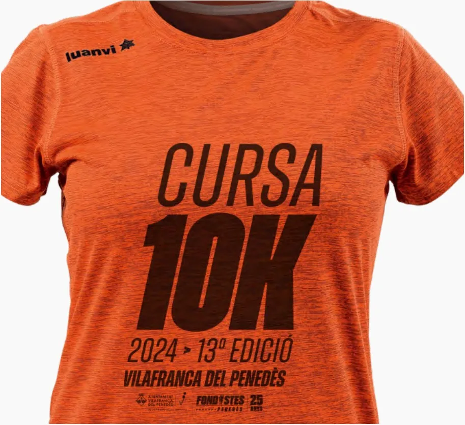
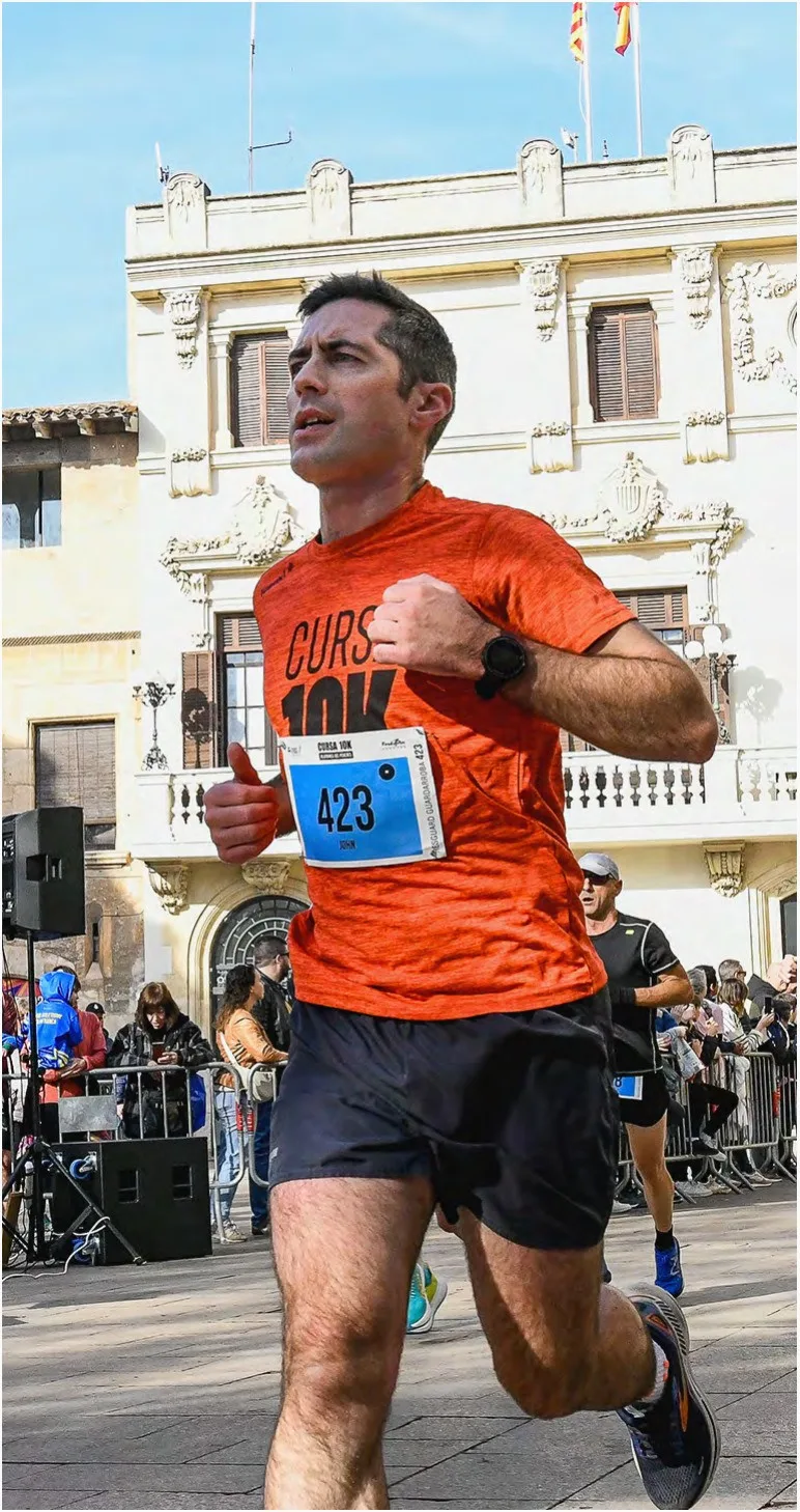
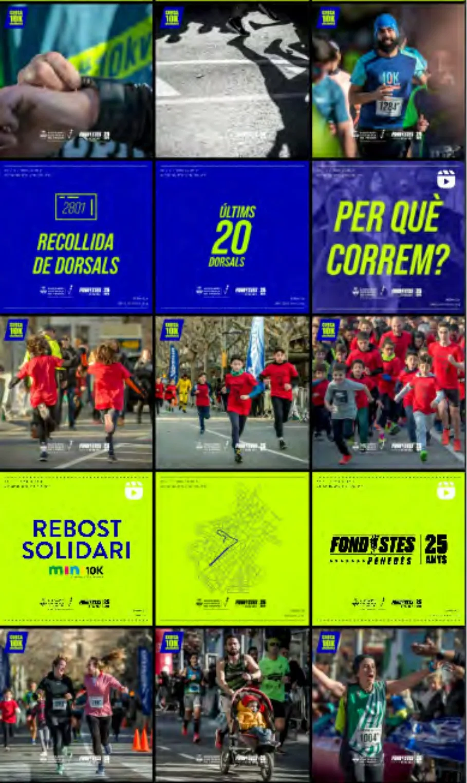
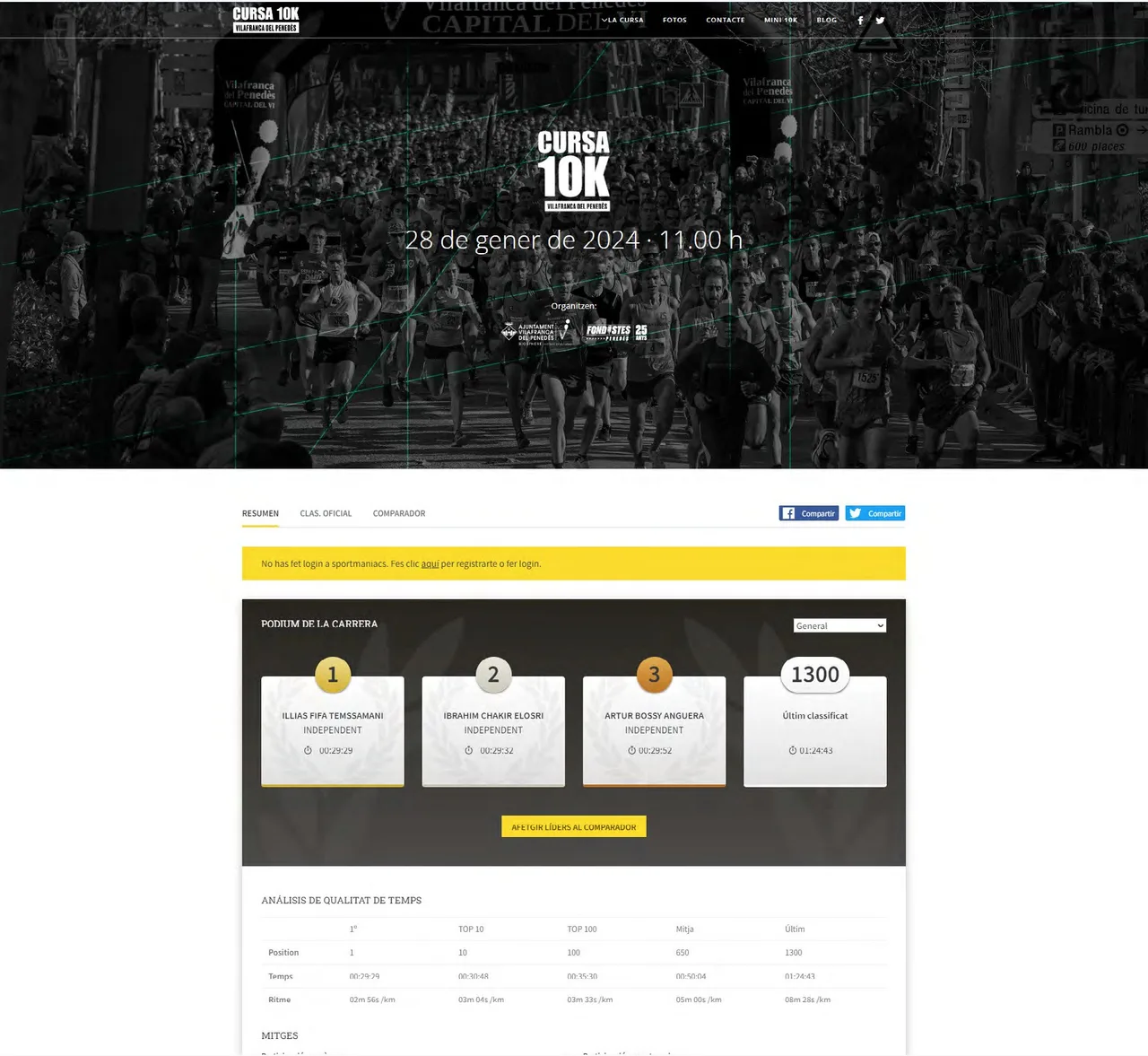
With these elements we solved the pieces you can see in context. An orange Cursa 10K 2024 T-shirt with dark italic lettering. The first-place certificate, shown in the cover photograph against a pink backdrop. An Instagram grid that alternates photos of runners with communication pieces in electric blue and lime: bib pickup, the last 20 bibs, the question “Per què correm?” (why do we run?), the charity snack stand of the mini 10K and a map of the course. And a results website with a dark header and the podium.
The result
The result is a race with an identity of its own, recognizable on the T-shirt, the certificate, the feed and the website. The same decisions (italic, diagonals, two high-contrast colors and a monospaced face for data) repeat on every item and make the race’s communication look like the work of one hand, even when different people publish it.
For the studio, it is an example of what interests us in local sport: working with a Penedès event with real brand judgment, so that a small-town race has an image worthy of the people who compete in it. If you are organizing a race or a sports event and need an identity that works from the T-shirt to the phone, we would be glad to talk.
Service: Brand identity and naming · Festival and event design